Showing posts with label Ahmed Issa. Show all posts

Thursday, May 2, 2013

Catherine by Sean Scully (1989)

Looking at this, there is not really much to see, but in some way somehow, I put it together, and it make so much sense to me.


Looking at this Moroccan attire made me think of the painting. It is said that this is where the artist was inspired by the stripes for the very first time.
Back to the initial piece, it is as it is telling a story.


Personally, I think it is a very abstract painting, and it is open for a very wide interpretation, but I have realized that in order to fully understand the work; one would have to go beyond the title of the work to see why, when and how it was created.

Looking at this specific work and other works; it is a little easier to draw a line that describes this relationship between the painting and the painter, not to forget the emotions.

A whole series of paintings where called Catherine in honor to the painter's wife called Catherine Lee, and they chose which ones of them really resembled something significant. 

See this video:  http://vimeo.com/18198903

SOURCES:


Burj Khalifa, SOM (Skidmore, Owings, Merrill) by Adrian Smith (2004-2010)

Upon my own personal visit in 2009, I saw this 2717 feet sky crapper hidden behind the clouds of sand from an earlier sandstorm that weekend.


Some of the many questions that I was dealing with was: why that tall? are they really going to use it? and don't it get really hot on the top floor?

The construction was stuck and nothing was happening. There was not  a living sole at the sight and despite it 's magnificent character, my questions really broaden the daylight, because it was such subjects that just arose when people were visiting.

The tower was originally called Burj Dubai. Burj being Tower, and its construction had passed the highest building Taipei 101 in Taipei, Taiwan in 2007. The name change happened because of the Emir Khalifa bin Zayed Al Nahyan, President of The United Arab Emirates as a gesture of his economic help during the economic crisis that was going on in 2009.


It is amazing how the functioning of that building came about and it is also very impressive how different architects from the world united to make such a great structure. The tower is influenced by the flower Hymenocallis that closes in a dome shape at the top based of of Islamic architecture.


The building requires a quarter billion gallons of water transferred through 62 miles of pipe everyday. Moreover, the park called Burj Khalifa park is also inspired by the flower, Hymenocallias.

In addition, please watch this floor plan


SOURCES:


Saturday, April 27, 2013

Untitled (portrait of Ross in L.A.) by Felix-Gonzalez-Torres (1991)


As a candy lover, a very happy feeling arouses when one sees 175 pounds of candy. Moreover, it is even encouraging to take from the pile.


Nevertheless, behind every piece there is a meaning. This time around it is the initial body weight of partner, and artist Ross Laycock whom died to AIDS complications in 1991.

Ross Laycock


Personally, my first thought was that this is really disturbing, and so cruel, but I understood that the meaning the work was misinterpreted. People with HIV that develops to AIDS goes through severe weight loss and they end up to nothing near death.

Our artist at hand is sending the image of love and loss, where he encourages people to take a piece of candy. I interpret it as if he is putting the sole of Laycock in the viewer’s perception. It is like transferring his soul to other, and letting his spirit live.

Many conspiracies is revolved around the notion of AIDS, and why there isn’t any potential cure yet, and I would say that there is a potential cure out there, but it is probably being promoted as too expensive or too rigid.

Not only is the artist bringing his companion into the light, but also he is creating social awareness among people to tell them what is going on the world.

Please see this letter from Felix-Gonzalez-Torres to Ross Laycock

SOURCES:

Malcolm X and the slaughterhouse by Sue Coe (1985)


Our artist at hand has developed numerous interests during her life that involved injustice of both animals and humans. She is a very critical artist that constantly advocated social awareness through her art.


The social conditions we live in are hidden behind the media, and we are unaware to be fully knowledgeable about what is going on around us. Sue Coe has an unstoppable method of creating that spark for closure about the environment; with a specific emphasis on animals.

Throughout her career she is bringing social awareness around how we treat animal in the slaughterhouse, and not to mention how they are treated in general before and after death.

She gives the animal a speaking voice, a soul that extracts through her art. In this specific painting, Malcolm X, is incorporated. Personally, I think it is a wide open space for interpretation.

Malcolm X was a civil rights activist for humans, or more specifically for African Americans during his time (not to mention the continuity of hatred today), but our artist, Sue  Coe, is trying to MAYBE trying to emphasize the strong political message that is missing when it comes to animals through the hardship and pain of Malcolm X. 

Just like Malcolm X was assassinated and just like his aftereffect sweeps the world today, we are dealing with the same issue in regards to the animals that we see getting killed every day. A lot of it is pure waste and animal cruelty, and in general, I think it is the message that our artist is trying to convey. 

Please explore link #2 to see the graphic calculator that counts dead animals since the moment you enter the website. Moreover, I will include a recent work of Sue Coe that will imply her concern of where we are taking the world to. An End.

Sold by Sue Coe (2010)


SOURCES:

Monday, April 22, 2013

Flag for the Moon: Die N***er by Faith Ringgold (1969)

Without help of noticing or even trying, I believe every readers actually reading the title of this blog knows what the stars in the word entails. I refuse to express the saying, and be a part of the wagon, but I am here to project upon you, groundbreaking work from a very talented artist.


Throughout her art, there is a conveying message to be found that implies to the better understanding of the equilibrium between black and white, and from my own understanding I can see how brilliantly the artist directed her focus of 'studies' if you will towards children, because she sees how it can influence and have a longer lasting effect.

A very strong social activist in the 1960's was the thing to be. Sadly said, but true. With great oppression and civil right activation.  the American government was still in strong commitment to send a shuttle to space to lay feet on the moon before Russia could have the chance.

This flag looks quite familiar when looked upon shortly, but the white is blacked out to express a thought that says that black people is also a part of America, and they have become children on this nation as well. Behind the blue, and in the red of the painting is a "hidden" message to the reader that ultimately takes this representation on top of any movement for equal rights. The message can not be more vulgar, and looking at that today has not changed a lot.

It has been over 40 years, and there is still a persistent unconscious and conscious bias for people of color. Regardless of the political statement that the artist is conveying to the viewer, it would seem to be understood today that the fight for equal rights and liberty is still persistent.

(Adjusted)

SOURCES:


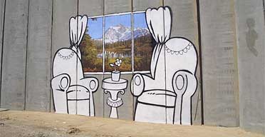
Graffiti Stencil (2005) by Banksy 'Window on the West Bank'

So inspiring, and so intriguing.


Street art is considered to be lucrative, and trashy. It is not environmental and absurd. With all that said, it is a norm that is followed to perceive such a intuition towards street art. This major generalization does not hold true for not one little exposed brick out there in society. Where some people tag walls for gang territory purposes, you have street artists expressing their feelings on the walls. It is the avant garde of today, and the shortest line of connection between the upcoming youth and art.

I remember from my own childhood that one would have to account for museums to see art exhibited under ethical terms, and to be quite frankly it made a lot of sense to me, but as art develop and deviate from its origins to its next revolutionized form it goes through a special transformation. That transformation involves heaven and hell to be strict. Critics rage about the shift, the viewer will be either more or less intrigued, the public has a say, and the whole spiral of people surrounded and influenced by art will go through some sort of change.

One encounter change all the time. Just as we speak, art, to take an example, is changing in a way that we will get to see when it is public through our social media. Everyday is innovative and life changing, and our artist, Banksy, is a living, breathing example.

With a masked identity to protect his freedom, Banksy travels the world to project his art against any canvas that can be a potential victim for his excellence. Specifically, in this piece, there is a political image of dismay that we can look back on forever to be in regret. The Window on the West Bank is a very upsetting representation for some. It fires up in different chambers of emotions for different people, but nevertheless, it projects a strong political statement that we are all familiar with.

Repetitive world history would give the implication that failure will by all means be rejected, and solved for better times, but disappointingly it is an ongoing ignorance. We say the The Great Wall of China, The Berlin Wall, and now The West Bank Barrier, all with the same purpose, which is to separate people.

Banksy takes a relaxed living room setting and projects a window in the middle that shows beautiful landscape and tranquility. Revolutionary in thought, we are experiencing this on safe distance. This art brought on an intense provocation and political stigma for change. SO just like many 'museum artists', Banksy is expressing a statement, a very wide open statement with great food for thought, or should I say food for change?


SOURCES:

Wednesday, April 17, 2013

For The Love of God by Damien Hirst (2007)

For the first time ever, I was exposed to his kind of bizarre art, and I must be honest; I was intrigued. There was a clear feeling of disruption and confusing in the auditorium this morning when a couple of dozen students were outraged by such creation. Nevertheless, everybody started to interpret the piece with elegant dedication, and there was a feel of both comfort and discomfort to be perceived. Ultimately, I have my own opinion regarding this work, but I will start out by describing our artist at hand, and also the context of his work before projecting my opinion.


From childhood, Mr. Hirst was bound to be different, and with a extremely uncontrollable relationship with his mother. The only thing his mother appreciated was his talent for drawing. Later on that developed a curtain characteristic of how he came around his art, and it is like as soon as he broke through the wall to the other side; meaning being a famous artist, he could pretty much put out whatever his mind took him to. It makes him untouchable to the critics and he will differ from other artists.

A main theme for Hirst has been death, immortality vs mortality. It is  a repetitive theme throughout his career that talks to the observers, and definitely talks to the critics and buyers. Very controversial the artist remains to be till the day today, but now to the emphasis of this particular work.

I developed a little theory of my own through all that I read about Hirst, and I see a clear pattern in his work. In February 2006, he opened a art exhibit in Mexico, and Mexico has a special holiday called "Dia de Los Muertos" which means the day of the dead. On such a day, many different things happens, where people that celebrate it goes an visit the dead, but among all the different traditions is the candy skull with flamboyant colors, shinny elements, and deep appreciation. Going beyond these lines, I believe that Hirst got his inspiration through that media. Nevertheless that could be a irrelevant relation according to John LeKay whom claims much of his work was plagiarized by Hirst. The question at hand would be if Hirst is reviving an image for better or worse means?


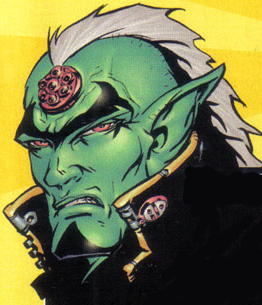
At hand, we are dealing with 17th century skull, remade with help of 32 platinum plates, and the original skulls teeth. 8601 clear cut diamonds are used which contextualizes 11106,18 carats. The big diamond on the forehead is inspired by a comic that Hirst used to read as a child called '2000 AD' where it is drawn to relations with the third eye being the watcher. In my opinion, Hirst has literally magnified the meaning of death and also literally tried to put a price on it.


According the public outrage, both in the auditorium this morning and in general; I must say I have to take a counter perspective. I believe that people has different ways to find their medium of what they want to produce and what they do not want to produce. I can draw so many connections to this way of producing art that has been very socially acceptable without any debate at hand. It is seen in Mexico, in the Pharaon's Egypt, the Easter Island, West-African masks, and the list goes on. I think it is a brilliant idea of conspicuous consumption, and the fact that he diffused his mother's saying into his work is a perfect message to any artist, or just in general any person that has been scared of doing something due to unrelated oppression.


SOURCES:

Monday, April 15, 2013

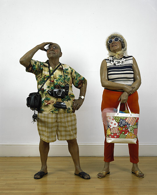
Tourists by Duane Hanson (1970)


When looking at Hanson work of art, there are some specific elements of interest that arises. First thought that hit my mind from this kind of sculpture was wax figures of famous people. I looked into some different artists that produce art incorporating wax, and there is a clear distinguishing line between the two different sculptures.


Hanson’s sculptures projects a contextual message of some sort that has a specific conveying message with relation to time. As of just regular wax sculptures in a wax museum you see emperor, pop stars, top athletes, dictators, great scientist and the list goes on, but never has it been seen that sculptures were created as a provocative message with very realistic means.


Polyester resin and cast fiberglass are the products used for constructing so powerful replicas of humans, and then adding thrift store clothing to the sculptures to make them look natural. This sculpture in specific, and the sculptures that resembles the same social norm or social class is a way for the artist to express where American consumption has taken the society to. He directed his art criticism against the American consumer society. All the sculptures from there started arising feelings of human isolation and boredom of the American middle and lower class.


Personally, I have been and seen wax figures in different cities in Europe, and I must say that it was quite fascinating, but through readings online and the whole art world’s comments on Duane Hanson; I can only sit and imagine how precisely detailed it must be. I tried getting a little closer, and thankfully YouTube has been helpful.


It is done to superb perfection, which is why our artist here is grouped under hyper realistic artists, but quite frankly I am sure it would at least 50% more realistic if these magnificent sculptures were studying with closer real life proximity.

I highly encourage you to watch Duane Hanson’s work throughout his years as an artist, and compare them to wax figures to see the difference. A sequel to the ‘Tourists’ sculpture was made by the name sculptures II (1988)


SOURCES:

Nora by David Em (1979) 'TAMU HVS EMPHASIS'


INPUT 1 (April 15, 2013)

Very interesting digital artist that has pioneered as one of the first computer-conceptual art, and his name stays relevant today. This specific artist virtually introduced the world to one of the first 3D imaging surfaces ever produced. 


Today, his art is specified in 4 subgroups, worlds, spirits, artifacts, and metamorphoses.
David Em is an artist I was not quite familiar with until today, but for his time and through his development, I see a very respectful and hard-determined field of art that involves many different aspects with regards to the spiritual, the scientific, the virtual, the unbelievable, the admirable, and the fascinating.

Virtually this art is represented in several ways to interpret, but I will first try to give my interpretation on it. As seen the colors used in this “computer imaging” that Mr. Em calls it himself is toned with dark colors which rises comfort, but the different panels in irregular directions creates a sense of loss protectiveness.


Moreover, I feel like there is a strong use of somewhat common geometrical figures that creates a sense of belonging.  I must say that it is rather hard to imagine how this imaging would have been perceived by me if seen in 1979 rather than 2013 where such art can be done much easier than it was done at the time.

At last, there is a poem written about the artist from famous science fiction writer, Ray Bradbury that depicts what sort of panels of thoughts professionals thought of when seeing David Em’s work.

See source 3 if text is too small


SOURCE:
5.http://academic.cengage.com/art/book_content/0495569097_fichner/ArtExperience_9e/assets/podcasts/Contemporary/MediaExplosion/index.html

INPUT 2 (April 17, 2013)

Today, I contacted the people behind David Em's official website to get more insight on how the production of 'Nora' was made. It has not been the easiest task to extract information about this specific work of David Em. Hopefully, I will hear back from them so that I can share information with the public.


Nevertheless, I will not leave my readers without something to get intrigued about for the day. I am doing some research on some books that hopefully will involve a part where the work of David Em was described, for today, I discovered a different side of the artist, and his love for Graffiti. Please take time to see the video that will direct your understanding of Los Angeles street artists.


SOURCES:
1. http://www.youtube.com/watch?v=LlMKt1gbTR0
2. http://www.davidem.com/03_contact/successfully_sent.html


INPUT 3 (April 22, 2013)

Not more than two days of wait! The humble people behind David Em's website sent me a reply on my questions regarding Nora, and here it is!


I am currently researching this equipment of use, and hopefully I will have more insight on it, soon. Nevertheless, I found the book I was looking for, and within the next couple of days, I will share some insight with you regarding David Em and specifically the work 'Nora'.

The Book
The Art of David Em: 100 Computer Paintings
Texts by David A. Ross and David Em
Harry N. Abrams, Inc., Publishers, New York
ISBN 0-8109-1044-6


Sneak-peak LEFT: Action (1979) RIGHT: Nora (1979) pages 34-35 of book

INPUT 4 (May 3, 2013)

Reading and analyzing the book has given me quite the insight on how David Em went around and approached the technological art. In the beginning of the book is a message from David A. Ross (CV:http://artpractice.sva.edu/faculty.html) describing the revolution of technology intact with art.

Mr. Ross mentions: "It was the Korean-born video art pioneer Nam June Paik who first predicted the future for this medium in discussion of the potential of the Paik-Abe video synthesizer, an early analog computer that was capable of distorting, reshaping, and recoloring (or colorizing) video."


Moreover, the frame buffer described in INPUT 3 e-mail is something "Em worked with a group of engineers to devise a relatively sophisticated frame-buffer, and electronic device that stores and displays a single frame of video information (the contents of one full video screen). It functions as the video counterpart to a blank canvas upon which an electronic painting can be created from scratch.

David Em pioneered in his work by trying to create his own paint, but he came to understand that what he had envisioned was impossible without mechanical media, so with time, other artists, and engineers; they developed a working frame buffer that could duplicate the capabilities of Xerox system in low resolution.

It is overall a good book where David Em himself talks about the pleasure of creating art without natural light like the impressionists, but rather with electronic light.

Moreover, the plates includes in his book are:

1. MAR. 1985
2. DESEOS. 1983
3. NAVAJO. 1978
4. HILLS. 1985
5. MIX 3. 1979
6. BILL. 1981
7. SAMUEL. 1979
8. EL NOTRE. 1986
9. HATTIE ROSE. 1979
10. FLARE. 1981
11. AMOR. 1980
12. VOLKAN. 1982
13. REDBAL. 1980
14. ACTION. 1979
15. NORA. 1979
16. TRANSJOVIAN PIPELINE. 1979
17. MING. 1979
18. BAGHDAD. 1979
19. GANDHI. 1979
20. APAINT 3. 1987
21. TMI. 1985
22. AT 20 WE  WENT THERE. 1985
23. THE FAR AWAY. 1986
24. ZOTZ'. 1985
25. BARBERA. 1986
26. MOUNTAIN 2. 1979
27. PURPTWIS. 1983
28. LLANOS. 1985
29. EDUARDO. 1985
30. JOE AND NARTUHI. 1985
31. CHIN LI. 1985
32. -| (DASH SLASH). 1983 Acrylic on paper
33. AKU 1978
34. EGG 2. 1979
35. KAOS. 1980
36. PATRICIA. 1980
37. ZWIRLZ. 1987
38. PARTY PARTY PARTY. 1986
39. EL SALTO. 1985 Acrylic on paper
40. CARIBOU 1. 1979
41. TWIST 1. 1980
42. JOSÉ. 1985
43. HEAVEN. 1986
44. TERRYL. 1986
45. WHERE 3. 1979
46. APPROACH. 1979
47. DRESDEN. 1979
48. LIZA 2. 1979
49. CALIGARI. 1978
50. SOUTH TEMPLE. 1981
51. KOLUMN.  1982
52. BRAXIS. 1979
53. STYX. 1979
54. APARTHEID. 1981
55. SUMA. 1980
56. JASPER. 1980
57. MAYA. 1982
58. PERSEPOL. 1980
59. RAGNAROK. 1980
60. AFTERMATH. 1980
61.CHANG. 1979
62. KIRBY 1. 1979
63. GALAXY. 1974 Mixed media on sheetrock
64. GUSTAF. 1985
65. BLANC. 1985 Oil on canvas
66. KO. 1981
67. SPERM. 1980
68. JELLY. 1979
69. CENTER 4B. 1979
70. PERZIA. 1980
71. TEMPLETWIST. 1983
72. ADONDE 2. 1981
73. SUBTER 4. 1980
74. GABRIEL. 1980
75. VISION 10. 1980
76. ESCHER. 1979
77. DREAM. 1979
78. VOLANDO. 1979
79. WAVE. 1979
80. ELLEN. 1986
81. SELF A. 1982-1983
82. INVIERNO. 1984 Oil on canvas
83. TURNER. 1985
84. SALVADOR. 1982 Oil on board
85. PILLARS. 1986
86. ART 3. 1987
87. CARIBOU 2. 1986
88. DAGGER. 1987
89. NUBES. 1985
90. SUNRISE. 1985
91. THE FIVE OF US. 1983
92. KLEE. 1986
93. SPARK. 1986
94. MICHELE. 1986
95. TOLTEC. 1985
96. STRETCH. 1986
97. PAINTING 6. 1986
98. XIBALBA. 1986
99. TEEC NOS POS. 1985
100. VOL. 1986

This is a list of the works included in the book. Unfortunately, I can not upload any of these pictures due to copyrights, but I strongly encourage the purchase of the book or to find it in a local library to explore the phenomena created through scientific machinery.

INPUT 5 (May 3, 2013)

In the technical note of the book, I found the system that Nora was made with in nature with the e mail I received.

"the heart of the system I worked with consisted of a Digital Equipment Corporation (DEC) PDP 11/55 minicomputer with an Evans and Sutherland 8-bit frame buffer and Picture System 2 (an interactive vector display system) hooked up to it and Conrac RGB monitor. The system allowed be to select from palette of over 16 million colors, although I could display only 256 of them on the screen at any one time."