Showing posts with label Bekah Bogdanoff. Show all posts

Thursday, May 2, 2013

Final: House by Rachel Whiteread


Rachel Whiteread is a British artist of the yBas group (Young British Artists) who became famous for her work “House”, built in 1993. Her art was influenced by minimalism, and she created gallery pieces similar to “House” before its creation. She filled the empty space of rooms and sinks, but she wanted to fill in the space of an entire house. It took years to acquire a house to fill, and the location ended up being the most distinct characteristic of the piece. Whiteread did not know that “House” would become so popular, and because it became public the instant she finished it, she didn’t get the usual time in the studio to evaluate her work before presenting it to people. In order to view her work, she would have to disguise herself and park down the street. For “House”, she became the first woman to win the Turner prize.

Whiteread found a house on 193 Grove Road, Bow, East London which was part of a neighborhood that was going to be demolished to make room for a new, more elite complex. The original house dated back to the 1950’s and its Victorian style embodied the nostalgic essence of old British homes. Whiteread wanted an old house because it commented on how people demolish old homes to make modern houses, which in turn would be knocked down in 20 years. Ironically, the piece only lasted 2 ½ months, and the very same day that people voted to give Whiteread the Turner Prize, a committee voted to demolish “House”. It won a 40,000 pound prize from the K foundation for the "Worst Artist for the Year". Originally Whiteread wan't going to accept the prize, but the committee threatened to burn the money if she didn't take it. She ended up donating the money to charity for the poor and to young artists. Also ironically, the previous owner of the house detested the work.

To make “House”, Whiteread sprayed the interior of the house with plaster and concrete and then peeled away the exterior structure to create a cast of the interior space of the house. This made an archeological-like form that resembled a fossil. The piece also resembles a ready-made because its essence was an already made form.

“House” caused a lot of public controversy. People viewed the work as a symbol of the gentrification that was taking place in the area. The government was kicking out the poorer class in order to make room for a nicer neighborhood. Housing policy was a big deal at the time because recent conservative policies had contributed to homelessness, empty houses, and council houses sold to their owners, and the government encouraged owner-occupancy. People thought the government was marginalizing the working class, and “House” memorialized their traditional way of life. Additionally, some thought that the money used to make it could have been used to make houses for the poor, artists protested its demolition, and people viewed it as wasteful, ugly, unwanted, and pointless. The different viewpoints caused different actions. Because the house couldn’t go in a gallery, it remained susceptible to demolishing actions. Some people spray painted on the house, saying “Not art,” “Wot for,” and “Homes for all, Black + White”. One time some drifters approached the house with tools in order to break through the shell of “House” and re-inhabit the work. The openness of the work expanded the accessibility of modern art because not only could anyone freely view the work, but also it relocated modern art from the elite areas to a lower class area. In fact, the work achieved so much popularity that in the few months that it existed than people came from all over the world to view it, and it created a constant traffic jam. Because of its publicity and the issues it brought up, House permanently imprinted itself in the public psyche, even though it lasted a short time. Like the Eiffel tower, people did not like it. However, unlike the Eiffel tower which was also originally supposed to be temporary, “House” did not last.
"House” deals with many different subjects such as death, time, absence, filling, universality, duality, and then nature of art. One of the concepts in psychology is the human tendency to fill the space of something lost in an attempt to keep it alive. “House” embodies this concept by filling in the space of the condemned house in order to keep it alive and remembered. However, empty space “has no other function than to make life possible”, so in trying to preserve life, filling kills the life. Some of the most distinguishing features of the Victorian house used to make “House”, such as the staircases and molding, became entombed in concrete when Whiteread filled in the house. The structure paralleled a sarcophagus, illustrating how the piece both silenced and preserved the house’s domestic life. Like the pyramids of old, it did not contain life yet preserved the memory of life by creating a cast. Casts trap an object in time, parodying the object by being so like the object but also marking its absence. They trap the objects form in space as if the object still existed and solidify the space’s life and potential. They use the present to speak about the past, but in doing so they destroy the past. This illustrates the unrecoverability of the past, and “House” addressed the issues of the lost way of life and community in the demolished neighborhood. Therefore, absence is a major theme of this piece.

It is impossible to view the piece without becoming aware of the house that is now missing. In order to make the piece, Whiteread had to destroy the original object and function. “House” embodies the trace or the scar of the empty space which used to be enclosed by the residence. One could say that you used to be able to see the space, but Whiteread made it so you couldn’t. Architecture “makes space for desire”, and so by filling in the space, Whiteread nullifies any past desires in the house. She freezes its potential. People tended to act negatively to the piece because it was disconcerting to see the space turned inside out and they could not enter the solid space. The only place a person could enter is the spaces where the walls used to be, symbolizing how people provide the structure that defines the interior, nostalgic space. Through “House”, Whiteread made the safe interior space of a house into public, exterior space. She allows the private to become publically open to viewing and scrutiny, and she also visualizes alienation. Some people are very lonely in their lives and their house, and this piece makes the lonely space very available to everyone. She also allows what was once intangible to become tangible, and creates an uncanny situation in which there is something where there should be nothing. The invisible becomes visible.

The facts that a woman created “House”, that the piece addresses domesticity, and that she is making the invisible visible creates a commentary on femininity. Visibility tends to be for the male and invisibility for the female, and this shows the representation of making the female more visible. “House” addresses many other aspects of duality besides male versus female. It challenges the idea of space versus materiality, culture versus nature, sociality and solitude, dwelling versus exclusion. Additionally, the piece polarized people. In general, about half of the viewers liked the piece and the other half hated it, and the division happened within all social, economic, gender, and age groups. Just as “House” divides, it also universalizes through its reference to shelter and its simplicity. Everyone needs shelter and everyone has feelings about home, so the piece evokes universal emotions by making a general reference to all houses. People empathize with the former residence’s loss.

“House” also questions the essence of art and public monuments. It can be considered art because it takes the ordinary and makes it extraordinary. However, just because it is art doesn’t make it impervious to demolition. Ironically, it formed a monument to some covert subject, yet it only lasted a couple months. Usually monuments last for a long time and represent a very clear purpose, but “House” didn’t have a clear purpose. Because it didn’t have a clear meaning, it created more interest than monuments usually do. Monuments tend to become invisible, but “House” lasted its whole life as a major social focal point. Whiteread commented that "it’s a shame it didn’t get to become invisible like architecture becomes invisible. In fact, since it was demolished, it exists in the art psyche despite the fact that it only exists in memory. People flocked to it, and many different speculations swirled around it as to whether it memorialized the domestic life, the community that once existed in the neighborhood, or the actual house itself. They questioned what deserves to be memorialized.


http://books.google.com/books?id=s2y15UBRoo0C&lpg=PR5&ots=mbweFkcDiW&dq=whiteread%20house&lr&pg=PA10#v=onepage&q=whiteread%20house&f=false

http://www.menzies.acadnet.ca/314/314%20Readings/Shone_From%20Freeze%20to%20House.pdf

http://www.jstor.org.lib-ezproxy.tamu.edu:2048/stable/10.1086/342690

http://www.jstor.org.lib-ezproxy.tamu.edu:2048/stable/778151

http://www.tandfonline.com.lib-ezproxy.tamu.edu:2048/doi/pdf/10.1080/17454839808413053

http://onlinelibrary.wiley.com.lib-ezproxy.tamu.edu:2048/doi/10.1111/j.1467-8357.2005.00574.x/full

http://www.tandfonline.com.lib-ezproxy.tamu.edu:2048/doi/pdf/10.1080/02564710903226676

http://www.artangel.org.uk/projects/1993/house

http://www.tandfonline.com.lib-ezproxy.tamu.edu:2048/doi/full/10.1080/0950236X.2010.521666

http://onlinelibrary.wiley.com.lib-ezproxy.tamu.edu:2048/doi/10.1111/j.0141-6790.2003.02603001.x/pdf

http://ieeexplore.ieee.org.lib-ezproxy.tamu.edu:2048/stamp/stamp.jsp?tp=&arnumber=580317/molyneux%20on%20sensation%20show%20ybas.pdf

http://www.google.com/url?sa=t&rct=j&q=&esrc=s&source=web&cd=2&sqi=2&ved=0CEAQFjAB&url=http%3A%2F%2Fwww.independent.co.uk%2Farts-entertainment%2Fart%2Fthis-is-the-house-that-rachel-built-rachel-whitereads-house-is-one-of-the-most-extraordinary-public-sculptures-to-have-been-created-by-any-english-artist-working-this-century-says-andrew-grahamdixon-here-he-examines-the-work-pictured-by-nicholas-turpin-and-below-whiteread-and-three-other-artists-nominated-for-the-turner-prize-describe-their-work-1501616.html&ei=GY1xUbmaH8np2AXR54G4CA&usg=AFQjCNGf4LdNy5vbXTIkrRaZqbtXznzKOg&sig2=Jqackm_d65f_2bJAMCNaMA&bvm=bv.45373924,d.b2I&cad=rja

http://www.moma.org/collection/artist.php?artist_id=6910

http://sites.cca.edu/currents/sightlines/pdfs/08goodin.pdf

http://etd.ohiolink.edu.lib-ezproxy.tamu.edu:2048/send-pdf.cgi/Whitson%20Catherine.pdf?ucin1306498840&dl=y

http://onlinelibrary.wiley.com.lib-ezproxy.tamu.edu:2048/doi/10.1111/j.1531-314X.2006.00076.x/pdf

http://eic.oxfordjournals.org.lib-ezproxy.tamu.edu:2048/content/54/2/103.full.pdf

http://www.telegraph.co.uk/culture/art/art-reviews/9995657/Rachel-Whiteread-Gagosian-Gallery-London-review.html

http://www.guardian.co.uk/artanddesign/1993/nov/25/20yearsoftheturnerprize.turnerprize1

http://galleryoflostart.com/#/13,0/essay

http://www.sculpture.org/documents/scmag04/april04/WebSpecials/whiteread.shtml

http://www.guardian.co.uk/artanddesign/2013/apr/06/rachel-whiteread-life-in-art

http://www.guardian.co.uk/artanddesign/2007/sep/08/art10

http://www.guardian.co.uk/artanddesign/2003/nov/01/20yearsoftheturnerprize.turnerprize17

Monday, April 15, 2013

Chrysler Building

The Chrysler Building, designed by architect William van Alen,  is one of New York's most famous landmarks. It stands at a height of 1,064 feet tall. It was completed in 1930, during a time when people were scrambling to create the highest building in New York. Originally, the Bank of Manhatten Trust Company was going to be at least 60 feet taller, but at the last minute the building crew took 90 minutes to crown this monument with a slim spire that spiked the building into the the number one spot. Unfortunately, the title of "tallest building in New York" only lasted people completed the nearby Empire State building only a few months later.
The Chrysler building is decorated in an Art Deco style, with sharp angles and points, and Chrysler, the patron, wanted it to make "a bold structure declaring the glories of the modern age". When it was finished, he dedicated it to "world commerce and industry". The inside and outside gleam with granite, marble, and nickle, and there are statues of eagles on the 61st floor and gargoyles on the 59th floor. The gargoyles actually sit on top of winged radiator caps, yet another example of the car-themed decorum. The top is uniquely designed with stainless steel curves and triangles, and is very recognizable.

http://xroads.virginia.edu/~1930s/display/chrysler/frame-1.html

 http://tps.cr.nps.gov/nhl/detail.cfm?ResourceId=1638&ResourceType=Building

http://www.pbs.org/wgbh/buildingbig/wonder/structure/chrysler.html

Sunday, April 7, 2013

Aspects of Negro Life, the Negro in an African Setting

 This painting, "Aspects of Negro Life, the Negro in an African Setting" by Aaron Douglas, portrays African people dancing a war dance in a reference to the African-American's original ancestors. In the background stand people with Egyptian headdresses, and the floating statue in the middle represents the importance of the African spirituality. The concentric circles and angular lines represent the movement of the music in the piece. It is the visual representation of African music. Also, the forms seem to connect to each other in the same way that the African-American people may be connected to the soil and old folk lore of Africa.

This piece was created during the Harlem Renaissance as a part of a panel of pieces called "Aspects of Negro Life". There are four panels altogether, and they tell the story of the African-Americans as their ancestors progressed from free Africa, to slavery in the United States, to freedom again after the civil war, and finally to their assimilation into Modern city life. It was commissioned by the New York Public Library in Harlem.

http://www.tandfonline.com.lib-ezproxy.tamu.edu:2048/doi/full/10.1080/00313220701431427

http://www.artic.edu/aic/collections/exhibitions/AfricanAmerican/Study

http://books.google.com/books?id=f4804eUQ9YQC&lpg=PA243&ots=A8Qjl1ZUWp&dq=Aspects%20of%20Negro%20Life%3B%20aaron%20douglas&lr&pg=PA282#v=snippet&q=negro%20in&f=false

aaron douglas aspects of negro life; negro in an african setting


Queen Elizabeth II

 Lucian Freud was the grandson of the famous Sigmund Freud. He painted "Queen Elizabeth II", and it created a lot of stir, as anything regarding royalty tends to do. Freud got the commission via the queen's private secretary, of whom Freud had painted a portrait. He viewed painting the inner life of such an iconic face as a ultimate challenge. He choose a smaller canvas, and used broad, almost structural strokes to create the piece.
People were outraged when they saw this portrait, comparing it to the look of a rugby player, a bearded man, and a stroke-inflicted dog. Some hypothesize that the common viewers did not like the portrait of the queen because they had a different perspective of her than the artist. Freud was able to see the queen face-to-face multiple times in different and more intimate situations than the common subject. Because of this he formed in his head a unique impression of her.
Others compare this portrait to a portrait of the artist themselves. Often when painting royalty, the artist projects his or her own image onto the sitter as a sort of alter-ego of themselves. The queen's hair color and shape of the eyes, lips, and chin all resemble that of the artist. In the artist's self-portrait, his hair has a form similar to the queen's crown.


http://www.everypainterpaintshimself.com/essay_pdfs/BritMonarchs3.pdf

http://proceedings.spiedigitallibrary.org.lib-ezproxy.tamu.edu:2048/proceeding.aspx?articleid=876167

www.royalcollection.org.uk/eGallery/object.asp?searchText=freud&object=100130&row=0&detail=about
(this last link has the information about the painting in the second slide, under "more information")

Current

Bridget Riley's "Current" presents a sea of movement and contrast. She wanted to create a piece which involved the space between the painting and the viewer, and she achieves this through optical illusion. The wavy lines seem to move up and down, undulating like an ocean current and acting very much like elusive waves that one can not seem to quite locate. Curved forms seem to come out towards the viewer and makes him or her sometimes dizzy or nauseous. At times the intense movement even creates a sense of color and tires out the eyes. All of this accoplishes Riley's goal of making "the space between the picture plane and the spectator...active", but it does it in a strong and almost violent way. The viewers felt shock and sometimes anger.
This is an example of Op art, in which artists used knowledge about visual perception, science, and technology to create their art.


http://www.guardian.co.uk/culture/2010/nov/27/bridget-riley-national-gallery-review

http://www.jstor.org.lib-ezproxy.tamu.edu:2048/stable/779061

http://hdl.handle.net.lib-ezproxy.tamu.edu:2048/1721.3/39885


Marilyn Diptych

http://www.jstor.org/stable/3043740
http://www.jstor.org/stable/778760
http://books.google.com/books?id=eU_MFhr0kgsC&lpg=PA129&ots=Q4ET87-hfc&dq=Marilyn%20diptych&lr&pg=PA132#v=onepage&q=Marilyn%20diptych&f=false
Warhol's "Marilyn Diptych" is a print on silk screen. It portrays the famous movie star first in vibrant and clear color and then in marred black in white. The black and white section may represent Warhol mourning her suicide, and the color may represent his view of her vivid yet impersonal media persona. The bright colors emphasize the materiality of both her makeup and her image, and by reducing her image to a stamp-like appearance, he illustrates how people can again and again reproduce her false image. The mass production of her face makes her seem less human and more iconic. He uses the repetition to comment on the mass consumption of symbols, even if they are people. Marylin symbolized visual-femininity and a glamorous fantasy of the female body. The right side of the work shows a more realistic view of her. The broken and faded appearance of her faces symbolize her cracked personal life. The press slips and makes messes, and her face decays as the images progress to the right, just as she decayed as time progressed.
In the same way that a soup can is mass produced and marketed, Warhol is stating that a celebrity can be designed and mass marketed to the public. The color versus the black and white makes one think about the difference between the market image of a celebrity and the harsh reality of their life.
Warhol created pieces about mass media because he didn't want to make art for art's sake. He believed in business art, in which art pieces are designed and mass produced in an efficient way in order to make a profit. He took the ideas portrayed in his art pieces, like "Marilyn Diptych", and applied them to the presentation of the art. Instead of creating something original and singular in its presence and its creator, Warhol hired people to create his art and payed them to mass produce his works.

Thursday, April 4, 2013

cyclops


 "Cyclops" by William Baziotes is a piece inspired by Baziotes' trip to the zoo. He said he fed the rhinoceros, his favorite animal, and was intrigued by both the animal's playful and gentle nature and its cold, deadly eyes. The the reference to the vile cyclops of mythology and the rhino's relation to prehistoric animals bode of evil.The mythological reference of the painting resembles the old academic paintings.
Baziotes did not begin a painting with the end look in mind, but he believed that the process as well as the final outcome was the work of art. He allowed the painting to develop its own appearance as he worked on it though a process called automatism, or automatic drawing. Once he had finished a work, he named the piece based on the final result. "Cyclops" The painting came from his subconscious. This work is characterized by biomorphism, or a resemblance to a living organism, usually an amoeba or protozoan.
It is one of the first Abstract Impressionist paintings to receive wide-spread recognition when the Art Institute gave Baziotes the Walter M. Campana Memorial Purchase Prize.


http://books.google.com/books?id=75yZ9vMLeBYC&pg=PA212&lpg=PA212&dq=baziotes+cyclops&source=bl&ots=jQkhUIDG41&sig=c7CJWHjbSCuontpRojO3H4F33Qc&hl=en&sa=X&ei=jTBcUYFhkfbZBbLqgGA&ved=0CGgQ6AEwCTgU#v=onepage&q=baziotes%20cyclops&f=false
http://books.google.com/books?id=_5Q9bH24kocC&lpg=PA6&ots=Hp45SxT-5j&dq=baziotes%20cyclops&lr&pg=PA12#v=onepage&q=%20cyclops&f=false
http://www.artinstituteimages.org/searchresults.asp?image=00000113-01

http://books.google.com/books?hl=en&lr=&id=_5Q9bH24kocC&oi=fnd&pg=PA6&dq=baziotes+cyclops&ots=Hp45SxT-5j&sig=okIcWofYQYzUNbfI2ZvKfQ6h3wk#v=onepage&q=%20cyclops&f=false

Tuesday, April 2, 2013

Woman I

http://www.jstor.org.lib-ezproxy.tamu.edu:2048/stable/886424

http://www.jstor.org.lib-ezproxy.tamu.edu:2048/stable/776968

http://books.google.com/books?hl=en&lr=&id=uIppTKfAZLoC&oi=fnd&pg=PA7&dq=de+kooning%3B+woman+I&ots=w5uIKa9pm3&sig=B9mf_f_ACebsbBelr60r6y3Sl80#v=onepage&q=woman%20I&f=false
  
Many people did not like the portrayal of the woman in this piece. They had trouble accepting the ugly woman with her strong presence. "Woman I" by de Kooning portrays a monsterous, partially nude adult female in striking colors and rapidly executed brush strokes. The eyes bulge like a bug's, her mouth is crude, and her body is a sitting blob of flesh. This horrific representation of a woman resembled the portrayals of women in graffiti. Some compare the horrific display to Medusa, the ancient mythical woman whose ugly face turned people into stone, and de Kooning and his friends celebrated ancient mythology. He stated that the woman in "Woman I" belongs in goddess imagery. She also presents herself in a pose similar to that of a pin-up girl, showing both her grotesqueness and her basic appeal as a woman. She is both threatening and vulnerable.
De Kooning knew that the piece was going to be legendary, long before it was created. Even after he had spent months and months working on it and then rejected it, it still became a monumental piece. It is the most reproduced painting of the 50s.
He worked repeatedly on the face, and it is grossly based on the faces of models of the time. He also made many preliminary sketches for this piece, even though for most of his pieces he did simply applied paint to the canvas. De Kooning loved the thick application of paint, and he said that thick application is why oil paints were invented. This makes the piece jump out at the viewer, and it emphasized the scandal of the piece.

Monday, April 1, 2013

The Skat Players


Artist Otto Dix created many grotesque paintings about dismemberment and war after coming home from WWI. His painting "The Skat Players" portrays 3 vets who have lost nearly everything but their brains and hearts.  The people are rigged up with an assortment of prosthesis, from a snake-like hearing tube to a metal jaw to wooden or metal limbs. They appear nearly as mechanical as they are human. In the background, a skull smiles down on them from the lamp.
The mechanical aspect of the players may represent the attitudes of the rulers who saw people as tools for victory, in the same way they would view a tank or gun. The collage of materials makes the situation seem a little less real, and it is almost necessary to use this technique to mitigate such a horrific scene and concept. Additionally, the collage technique and the pieced together players with their prosthesis create a sense of disorder, referencing the chaos Dix must have experienced while fighting.  The skull from the lamp shows the presence of death.
The whole scenario is one of disorder, jumbled and disjointed assembly, death, and chance, exactly what one would expect at war.

http://books.google.com/books?id=h51Vt8CSm54C&lpg=PR8&ots=fPiBAFpKg8&dq=skat%20players&lr&pg=PA98#v=onepage&q=skat%20players&f=false

http://catdir.loc.gov/catdir/samples/cam033/2002041458.pdf

Friday, March 29, 2013

The Soothsayer's Recompense


This painting portrays a character from ancient myths: Ariadne. In the story she helps Theseus kill the Minotaur and escape the labyrinth, but he then abandons her on the Island of Naxos as she sleeps. The figure of Ariadne resembles the sketches in Reinach's "Repertoire de la Statuaire Grecque et Romaine" which portray Hellenistic sculptures and ideal human forms. Although the figure clearly looks like a statue, it has a dream-like, effervescent quality. This exemplifies the concept of hope for love and the heartache caused by such hope. The train in the background could be a reference to de Chirico's isolation from his father, or it could represent the movement of modernity. Either way, the painting portrays a feeling of abandonment. It could be the abandonment of the old classical style of art for new styles. De Chirico thought that his contemporary artists and culture emphasized ideas over quality of painting, and he believed in the importance of skill and talent in art. The train could also represent the abandonment the artist felt from his father. Many of de Chirico's other paintings address the concept of isolation. Part of the sense of isolation comes from the bare scenery. De Chirico created fall scenes in his art, as he thought that the fall was a season of recovery after harsh and feverish summer. He liked the long shadows, wide open spaces, and mystery of fall. These characteristics and the Italian porticos in his work were influenced by his 20s when he read the works of Nietzsche.
 "The Soothsayer's Recompense" was created using a grid system called "squaring up" to plan his composition, create balance, and manage perspective. De Chirico used this in many of his other paintings he created in 1913. The painting is one of the larger paintings created by de Chirico, and it is one of the two largest paintings in his Ariadne series.


 http://www.jstor.org.lib-ezproxy.tamu.edu:2048/stable/30221988
http://www.jstor.org.lib-ezproxy.tamu.edu:2048/stable/2929729
http://www.jstor.org.lib-ezproxy.tamu.edu:2048/stable/3049787    p. 349
http://www.jstor.org.lib-ezproxy.tamu.edu:2048/stable/883282
http://www.philamuseum.org/collections/permanent/51288.html

Le déjeuner en Fourrure

Meret Oppenheim was a surrealist artist, and she created this work in 1936. She found the idea from a conversation with Pablo Picasso about her fur covered bracelet. He stated that one could cover anything in fur, and she said "Even this cup and saucer".
She created it using a low quality cup, plate, and spoon covered in luxurious gazelle fur. It is a paradox of cheap and fine, attractive and repugnant, intriguing and ridiculous. It juxtaposes the cheapness of the low quality utensils and the high-class fur, creating a essence of both humility and extravagance. It is also attractive because of the soft fur, yet it would be repulsive to feel that fur inside one's mouth. Finally, the form covered in fur stimulates curiosity, but it is so useless and frivolous that it is ridiculous. All of this is in tune with the surrealist's emphasis on "convulsive beauty", because it is nonsensical yet intriguing.

This work sparked Oppenheim's popularity and gained her instant recognition as a surrealist, but unlike most surrealists, she did not want social revolution. Her art more explores relationships between objects in nature and society, and it like some pre-surrealist artists, such as Paul Klee and Jean Arp, in it's reference to nature and playful connections between living and non-living objects. Oppenheim's childhood in Switzerland may have influenced her preference towards nature, and her artistic grandmother could have been a strong factor in her artistic development. People relate this piece to feminine creativity, with the soft fur and domestic utensils. However, its off-putting nature creates a parody of femininity by exploring the odd combination of female-related objects.


http://www.jstor.org/stable/884234

http://www.jstor.org/stable/3245744

http://www.jstor.org/stable/488108

http://www.moma.org/collection/object.php?object_id=80997

Sunday, March 17, 2013

Music, Pink and Blue

Georgia O'Keeffe wondered about and explored the idea of synethesia. Her art teacher Arthur Wesley Dow from Columbia University believed that the visual expression of invisible music superbly represented the idea of abstract art, and O'Keeffe embraced this idea. She created "Music, Pink and Blue" in response to a symphony, and although it may appear to take on some concrete shape, it is not modeled after any concrete object but after the invisible music she heard. The colors came from her imagination, and they are bold and contrasting yet subtle and in harmony. O'Keeffe loved color immensely, and considered it the way to represented her view of the world.


 Certain  people think that some of  O'Keeffe's paintings resemble female anatomy, such as "Music, Pink and Blue", especially after Freud came out with his ideas about sexuality. However, there has been no confirmed conclusion about this subject.


http://books.google.com/books?hl=en&lr=&id=qggwE6o5ykAC&oi=fnd&pg=PA55&dq=Georgia+o%27keeffe+music,+pink+and+blue&ots=fqtFvWijv4&sig=mH2_aoiJz68HIbi2mqYTrr7tb2M#v=onepage&q=%20pink%2C%20%20blue&f=false

http://books.google.com/books?id=rTR1tRRfQo0C&lpg=PA31&ots=dXJs8AYWym&dq=Georgia%20o'keeffe%20music%2C%20pink%20and%20blue&lr&pg=PA185#v=onepage&q=pink%20blue&f=false

 http://www.jstor.org.lib-ezproxy.tamu.edu:2048/stable/10.2307/1483303

Gertrude Stein

Picasso's "Gertrude Stein" holds many historians' interests from several reasons. First, Gertrude Stein holds significant status by herself, aside from Picasso's painting. She was a homosexual modernist artist and author, and she befriended many cultural titans including Ezra Pound, Ernest Hemmingway, and Pablo Picasso. The painting itself took longer than usual to paint, as Picasso continued to put more and more paint on the work. He actually finished the head in Stein's absence, and many people stated that with the mask-like face, she looked nothing like the painting. "She will", he said, and he was right. Picasso's prolonged exposure to Stein as a model and his observation of her in different settings somehow managed to render a portrait that exceeded temporality. The painting offers much ambiguity as to whenther Picasso meant to paint a blatant portrait of physical features or the long-shifting, hard-faced features of Stein's personality. This unusual rendering style which sparked Cubism, combined with the popularity of both the artist and model, makes the piece rich with interesting details.

 http://books.google.com/books?hl=en&lr=&id=jGnXrfaioxQC&oi=fnd&pg=PT10&dq=gertrude+Stein%3B+picasso&ots=IwUrCL3I2e&sig=m1k0Pc8tkZR7ve5IXxCDGjcNJo8#v=onepage&q=gertrude%20Stein&f=false

http://www.jstor.org.lib-ezproxy.tamu.edu:2048/stable/465172?seq=2


http://www.biography.com/people/gertrude-stein-9493261

Laughing Girl

 Robert Henri's "Laughing Girl" shows a young child with short hair proudly showing her grin to the viewer. The model, young Cori Peterson, shows up in multiple other portraits that Henri painted during his summer in Holland in 1907. He loved to paint her, and he captured many of her spontaneous yet fleeting childish laughs. He liked her better than his other model, another young girl whom he described as "delicate" and "pathetic". This painting shows his style of that summer, where he went out on the street with small canvases and painted the ephemeral expressions of children. The brushstrokes are thick with only a dark space as the background. The girl's short hair shows that she was poor, because her parents probably cut it short to help maintain the lice and dirt. Painting poor people was not widely accepted by upper society, and at its premier on February 3, 1908, it did not receive a favorable welcome. However, a patron did purchase it.


 http://books.google.com/books?id=GAOCYTyD2_cC&lpg=PR11&ots=z2GTRopTVa&dq=Robert%20henri%20laughing%20child&lr&pg=PA109#v=onepage&q=laughing&f=false

http://www.the-athenaeum.org/art/list.php?m=a&s=du&aid=663

http://www.tfaoi.com/aa/6aa/6aa20.htm

The Wassily Chair

The Wassily Chair

Marcel Breuer designed this chair for Wassily Kandinsky, a fellow Bauhaus member, in 1925.  The Wassily chair is actually one of the first pieces of furniture created to be more of a room ornament than a comfortable place to rest, and its design is a radical departure from all that was created before it. Its steel metal tubes connect and overlap in space, forming an aesthetically pleasing as well as a functional chair. Straps connect the tubes to provide a place to rest one's body. Breuer's bicycle inspired the use of the metal tubes. The overall use of these materials represented a new form of furniture building materials.
The proportions and arrangement give an impression of strength. It has no cushions, and the planes are very flat and hard. However, its strong lines and patterns attract people and create an interesting accent to a room. The chair also comes in both a fold-able and unfold-able form.  Since its creation, people have continued to mass produce and use it in their homes. The name is patented, but the design is available to anyone.


http://books.google.com/books?id=OJZ6WcURGtgC&lpg=PA7&ots=-Un4uqiB7o&dq=wassily%20chair&lr&pg=PA40#v=onepage&q=wassily%20chair&f=false

http://www.mashpedia.com/Marcel_Breuer

Thursday, March 14, 2013

Nude Descending a Staircase, No. 2

Some consider the Armory Show in New York in February of 1913 to mark the beginning of the modernist art movement. It opened on February 17, 1913 to a grand opening of 4,000 people. The show displayed art from both American and European artists. They set up the viewings so that people entering would see American sculptures and paintings first, and then they would meander towards the more abstract and shocking European art. This encouraged a national pride towards American art and ridicule of the European's art. One of the most lampooned art pieces was Duchamp's "Nude Descending a Staircase, No. 2".
 This painting created much interest at its debut in the Armory Show in New York in February of 1913, although most people did not like it. One critic said it looked like an explosion at a shingle factory. Most people disapproved of the piece because they could not decipher it. The ones that could find meaning within the interlacing shapes did not approve of it because it severely departed from the standard depiction of the human form. It used both the cubist idea of fracturing shapes and the futurist idea of showing movement to portray a highly revered topic. Even when Duchamp had tried to display it at a cubist exhibition a year earlier, his brothers had rejected it because, according to them, nudes did not descend staircases, they reclined.
Despite initial backlash, Duchamp's "Nude Descending a Staircase, No. 2" in now hailed as a remarkable piece that relates even to modern day animation. It depicts around 20 overlapping renders of a figure as it walks down the stairs. Much like time-lapse photography, it defines the movement of different parts of the body and their path through space. If one knows where to look, one can get an impression of a line formed from the repeated knees or hips. Research, however, shows that most people do not pick up on these details of movement unless they have received previous instruction on where to look or if they have experienced such ideas before. Time-lapse photographs are used in contemporary studies for animation.
Duchamp did not know he would create such a sensational piece. When interviewed, he stated that he painted it when he was young and had no idea of the American culture or how they would react. However, he reveled in the attention, and even sold the piece for a satisfactory price.

http://www.ingentaconnect.com.lib-ezproxy.tamu.edu:2048/content/vsp/spv/2007/00000020/00000006/art00004

http://www.philamuseum.org/collections/permanent/51449.html

http://m.npr.org/news/Arts+%26+Life/172002686?start=10

My Egypt

"My Egypt" by Demuth portrays a grain elevator from the artist's home town of Lancaster, PA. Demuth used oil paints to make this work, and this is significant because his ailing health from diabetes made it difficult to use such a meticulous medium. He clearly thought that the point of this piece deserved the same attention as the classical oil paintings. The angles of the light create triangular shapes, referencing the ancient pyramids. They light also seems to come from different angles at once, showing that the artist incorporated the aspect of time into the piece, much like the European artists before him had done. As he sat and painted the grain elevator, he included the different light angles created by the moving sun.
The title presents a sort of enigma, and it takes some historical digging to decipher the meaning. Demuth liked to paint the machines and buildings associated with mechanical progress and then give the works cryptic names, such as his other work "Incense of a New Church". His sense of the ironic relates to the Dada movement, and he and Marcel Duchamp were friends. He found the American aesthetic captivating, but the disinterest that the general public took towards his works and purpose vexed him greatly. As a result he strove to distance himself from the culture through the use of irony. He plays on both time and identity with his name "My Egypt"; it relates a modern structure to the ancient pyramids, and he claims that ownership belongs to either himself or America. In light of his dissatisfaction towards the contemporary public's artistic tastes, he may be claiming ownership of the beauty in America because it appeared that only he could appreciate it. Some think that he decided to reference the pyramids in this piece because his ailing health caused the idea of death to be prevalent in his life. Additionally, King Tut's tomb had been discovered only 5 years prior, and ancient Egypt fascinated many people at that time.


http://www.jstor.org.lib-ezproxy.tamu.edu:2048/stable/1180724

http://www.artbeyondsight.org/amart/charles-demuth.shtml

Fagus Shoe Factory

The Fagus Shoe Factory represents a dramatic turning point in architecture. Construction on the building began in 1910 using the designs from Bauhaus architects Walter Gropius and Adolf Myer, and the factory is still open today. They envisioned a building that encouraged the workers towards better productivity through a pleasing work environment. Additionally, the owner of the factory paid the workers excellent wages, and the workers felt no need for a union.The idea was that if they workers enjoyed their time at the work-place, they would produce more effectively.
The design of the building preceded any other building in ingenuity and creativity. They built the factory out of glass, iron, and brick. The stairs are in the outside corners in order to free up more work space. The ribbon window installment all around the building is called a curtain wall. The building also included a free facade and a flat roof, all of which became major components of modern architecture after their introduction in this building. The free facade specifically freed up the architects to design the space in the most visually pleasing and comfortable way.

Shoji Screen
The design was heavily influenced by the works of Frank Lloyd Wright, who in turn was influenced by Japanese art. The form of the windows resemble Japanese shoji screens in their grid-like appearance. No longer was a window simply a hole in the wall, it had become a transparent screen and part of the building itself.


http://worldheritage.si.edu/en/sites/fagus.html 

http://books.google.com/books?id=aE7YtKrbNZAC&lpg=PA6&ots=BncW9QgQ_V&dq=fagus%20shoe%20factory&lr&pg=PA7#v=onepage&q=fagus%20shoe%20factory&f=false

http://www.all-art.org/Architecture/25-4.htm


Saturday, March 2, 2013

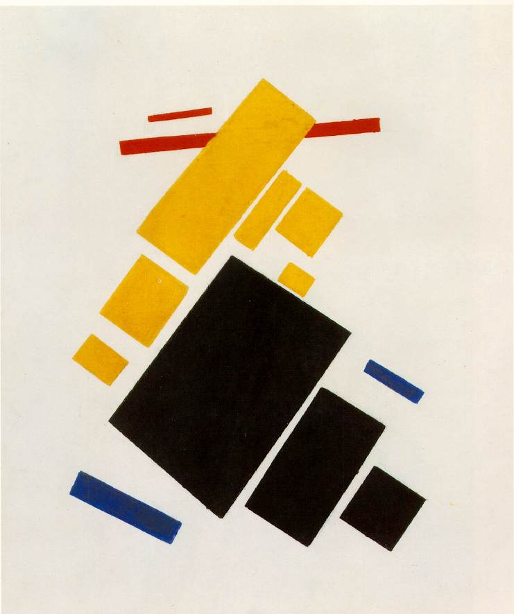
Suprematist Composition: Airplane in Space

 "Each form is free and individual. Each form is a world." 
-Kasimir Malevich

Kasimir Malevich was a member of the Suprematist movement. Like Marinetti and the futurist movement, Malevich wrote a manifesto explaining his purposes and ideas for the Suprematist movement. He wanted to create art pieces in which everyone would see the same thing. He painted a red square so that everyone would see a just a red square, nothing more than a red square and nothing less than a red square. He wanted everyone to have the same experience in order to unify the population and bring peace. If everyone shared the same experiences, then no one would feel superior, and social class and wars would cease.
 In the piece "Suprematist Composition: Airplane flying", everyone will only see 13 or 14 quadrilaterals of varying primary colors or black. He didn't want any of the colors to subjectively represent any emotions, and he didn't want the shapes to represent any emotions either. They do resemble buildings as viewed from above, which may account for the title. Malevich could have been trying to expose even the common man to the experience of an airplane ride. He said that he, "Uses forms to imitate the unifying effect of velocity", and this piece relates to this idea of the speed. At certain speeds, such as that of the airplane, recognizable forms become quadrilaterals of color and become objectified. All of this works to unify the overall human experience

http://www.ibiblio.org/wm/paint/auth/malevich/sup/

http://books.google.com/books?id=OfWQZbrud5kC&lpg=PA10&ots=JFo6TfpLeG&dq=suprematist%20composition%3A%20aeroplane%20flying&lr&pg=PA193#v=onepage&q=suprematist%20composition:%20aeroplane%20flying&f=false page 18

http://books.google.com/books?id=5_s5halYWu0C&lpg=PR7&ots=WsNodnoPLh&dq=suprematist%20composition%3A%20airplane%20flying&lr&pg=PA131#v=onepage&q=suprematist%20composition:%20airplane%20flying&f=false  page 130


Tuesday, February 26, 2013

States of mind II


The image "States of Mind II" shows people sleeping in a train. The left side of the painting shows many faces whereas the right side shows fewer faces. This reveals that the left side is the lower 2nd class seating, but the right side shows the upper, 1st class. Outside of the train, rain falls, and the rising sun reflects off of the window. The rain is washing away the old traditions, and the sun is taking the people into a new day. This painting represents the train of society taking people away from the old systems, such as class, and bringing them into a new and glorious future. This shows many characteristics of the futurist movement.

The futurist movement began in 1909 with Marinetti's "The Founding and Manifesto of Futurism".
It contained artist and writers, and they glorified speed, danger, violence, new ideas, and the destruction of institutions such as churches and government. They thought of war as the "ultimate hygiene"  of society. Marinetti supported Mussolini, and this contributed to the downfall of the movement. Boccioni participated in the futurist movement and painted images with fast vehicles, power, and movement from one place to another. The futurist painters made their own manifesto, in which they vowed to...

1. Destroy the cult of the past, the obsession with the ancients, pedantry and academic formalism
2. Totally invalidate all kinds of imitation
3.Elevate all attempts at originality, however daring, however violent
4. Bear bravely and proudly the smear of "madness" with which they try to gag all innovators
5. Regard art critics as useless and dangerous
6. Rebel against the tyranny of words: "Harmony" and "good taste" and other loose expressions
7. Sweep the whole field of art clean of all themes and subjects which have been used in the past
8.Support and glory in our day-to-day world, a world which is going to be continually and splendidly transformed by victorious Science.

The link below celebrates the futurist movement's 104th birthday and talks about how it is relevant today.

http://www.businessweek.com/articles/2013-02-20/happy-birthday-futurists-a-movement-turns-104