Showing posts with label Tanner Konarik. Show all posts

Thursday, May 2, 2013

The Man Who Sold His Own Shit

Piero Manzoni was an Italian, self-taught painter best known for his ironic approach to avant-garde art. Much like the work of  Yves Klein, Manzoni's work both anticipated and directly influenced the Italian Arte Povera movement. In his works, Manzoni eschewed normal media in order to "tap mythological sources and to realize authentic and universal values." Manzoni questioned traditional aims and methods of the artist and later called into question the  nature of the art object in works that prefigured Conceptual Art. In addition to countless fabricated objects, Manzoni used his own bodily functions and features in his experimental body of work; exploring the relationship between art production and human production. These included marking eggs with his thumbprints before eating them (Consumption of Art by the Art-Devouring Public), selling balloons filled with his own breath (Artist's Breath/Fiato d'artista), and planning to sell his own blood as art (Artist's Blood/Sangue d'artista). In Artist's Shit, perhaps the most notorious of these works, Manzoni sealed 90 small cans with the text Artist's Shit (Merda d'Artista), the label stating that it was "freshly preserved." Each tin can weighed 30 grams and was sold for the current market price of gold, a clear reference to the tradition of the artist as alchemist practiced by Marcel Duchamp among others. This link between anality and art is a leitmotiv of the psychoanalytic movement (Perhaps Manzoni was influenced by Carl Jung).  In a letter to Ben Vautier in 1961 Manzoni wrote:


"I should like all artists to sell their fingerprints, or else stage competitions to see who can draw the longest line or sell their shit in tins. The fingerprint is the only sign of the personality that can be accepted: if collectors want something intimate, really personal to the artist, there's the artist's own shit, that is really his."
The actual contents of the cans remains a much disputed enigma, since opening them would destroy the value of the artwork. In 2007 one of Manzoni's collaborators, Agostino Bonalumi, revealed that the tins are actually filled with plaster. However Manzoni's girlfriend Nanda Vigo, who helped to produce the cans, has claimed that they are actually filled with feces and an art dealer from the Gallery Blu in Milan claims to have detected a fecal odor emanating from a can. It is likely that the contents will never be revealed but that doesn't seem to concern collectors. In 2000 The Tate purchased a can for £22,300 and most recently cans  have been sold for  €124,000 and £97,250 in 2007 and 2008, respectively - quite a large increase from the original $37 in 1961. Actual feces or plaster, "It is a joke, a parody of the art market," Stephen Bury says, "a critique of consumerism and the waste it generates." Manzoni believed that the gullible art world would purchase anything signed by an artist, even a tin of feces. 

Sources:
http://www.tate.org.uk/art/artworks/manzoni-artists-shit-t07667/text-summary
http://www.pieromanzoni.org/EN/works_shit.htm
http://www.guardian.co.uk/artanddesign/2007/jun/13/art
http://en.wikipedia.org/wiki/Artist%27s_Shit
http://en.wikipedia.org/wiki/Piero_Manzoni


The Burj Khalifa


"It was the culmination of many years of work and one of the most thrilling moments of my career"

- Adrian Smith

The Burj Khalifa was designed by American architect Adrian Smith and is currently the tallest man-made structure in the world. The building was designed to be the centerpiece of a large-scale, mixed-use development that would include 30,000 homes, nine hotels, 7.4 acres of parkland, at least 19 residential towers, the Dubai Mall, and the 30-acre man-made Burj Khalifa Lake. This ambitious project began reportedly based on the government's decision to diversify from an oil based economy to one that is service and tourism based; in order to garner more international recognition, and hence investment. The tower’s organic form is derived from the culture and landscape of the region, strongly connecting the building to the surrounding context. As the tower ascends, setbacks occur reducing the mass of the building as it rises to the sky and triumphantly finishes in a spire. Burj Khalifa features an innovative condensation collection system used for irrigation of the tower’s landscape plantings. The system, in theory, provides about 15 million gallons of supplemental water per year, equivalent to nearly 20 Olympic sized swimming pools. According to Smith:
"The Burj Khalifa, was designed not for ego gratification or to fulfill a list of superlatives. It was designed to lift the spirits of a nation and a culture, and to bring joy and inspiration to its citizens."
Smith is one of the world's most prolific names in the design of supertall buildings and, in the words of  Antony Wood, "one of a relatively small number of architects who has designed and built a significant number of not only tall, but supertall, buildings internationally.” Many of his designs, as seen in Burj Khalifa, emphasize sensitivity to the physical environment, taking into consideration site orientation, climate and geography, and cultural and social influences. As of mid-2011 Smith has designed four of the world's eleven tallest buildings and his body of work includes some of the world’s tallest and most recognized buildings. According to Peter Irwin, "his designs transcend mere height and have become landmarks because of their graceful design and inherent sensitivity to local context and culture." It is these designs that have won Smith 5 international awards, 8 National AIA awards, 22 Chicago AIA awards, and 2 ULI Awards for Excellence. Smith was also the recipient of the CTBUH Lynn S. Beedle Lifetime Achievement Award in October 2011.

Click here for more on the Burj Khalifa and here for more on Adrian Smith.

Sources:
http://smithgill.com/work/burj_khalifa/
http://www.designmena.com/people/burj-khalifa-architect-adrian-smith-wins-lifetime-achievement-award
http://www.e-architect.co.uk/dubai/burj_khalifa_skyscraper.htm


A Short History of Modernist Painting

A Short History of Modernist Painting is a triptych by American artist Mark Tansey. The title is most likely a reference to Hebert Read's book A Concise History of Modern Painting. The triptych consists of three paintings, each in monochrome, that tell the history, so to speak, of a short period towards the end of Modernism.


Despite their seemingly informative nature, the actions depicted in the three paintings are nonsensical and and appear to have no deeper meaning; however, each painting refers to a different approach of popular painting over time. The first panel is a reference to the Renaissance aesthetic of creating paintings that appeared as if one was looking through a window. The woman washing her window is a metaphor for a Renaissance artist attempting to produce the most realistic window to another world as possible. Another proposed metaphor is how Impressionism 'cleansed' traditional painting. The second panel refers to the formalist idea of "art for art's sake" or the emphasis on compositional elements as opposed to iconography in art. The stubborn man can be seen as a metaphor for the stubbornness of modernist artists, much like the abstract expressionists, in their refusal to accept other ideals. The third panel is an allusion to the self-evaluation of postmodernist artists, like Tansey, as they contemplate their place in art history. An alternate theory is that this panel symbolizes Conceptualism and performance art which take place "in front of the surface" or are reflected by it.

Following postmodernist aesthetics, each panel is painted in Tansey's signature monochromatic style, giving the image a flattened feeling; challenging the more formal method of creating illusory depth. Tansey's style also gives the paintings a dated feeling as if they were produced in the 50's - drawing on the postmodernist idea of challenging society's preconceived notions of how things appear. In painting A Short History of Modernist Painting in a seemingly dated realsim style, Tansey speaks conceptually as to how postmodernism deconstructs the past in order to move forward. Tansey also calls attention to how representational images are inherently problematic - the contradiction between the actions represented in the paintings and their meanings - as they can be misinterpreted because they are unable to tell the entire story. Tansey discusses his approach by explaining “Pictures should be able to function across the fullest range of content.  The conceptual should be able to mingle with the formal and subject matter should enjoy intimate relations with both.”

Sources:
http://www.nytimes.com/1982/11/05/arts/art-mark-tansey-in-first-solo-show.html
https://unco.digication.com/jason_johnson2/fall_course_3
http://www.personal.psu.edu/ktk2/%20multivocal/lace.html
http://www.academia.edu/224188/Lesson_and_the_Arts_Mark_Tansey_Rembrandt_Van_Rijn_Matryoshka_Dolls_and_Galatians_3_23-29

Tim Hawkinson


"Tim Hawkinson's fantastical works suggest the profound strangeness of life, matter, and time. Interweaving images of bodies and machines, at scales that vary from the monumental to the nearly microscopic, Hawkinson conjures a world that teeters on the cusp between the real and unreal"    
 -Lawrence Rinder 

 Tim Hawkinson is an American artist most well known for his sculpture. Hawkinson's works most regularly explore the themes of self-portraiture, music, and the passing of time, as well as his artistic engagement with material, technique, and process.  In terms of self-portraiture, Hawkinson focuses on the re-imagination of his own body - toying with self-mockery at times - and what it means to create a self portrait of this new or fictionalized body; Self Portrait (Height determined by weight and Balloon Self Portrait are two great examples. He has cited the works of Mr. Ray and Bruce Nauman as inspiration for his exploration of new forms of self-portraiture. In 2002, Hawkinson created a poster sized image of himself with motorized features entitled Emoter (pictured). Emoter is a kinetic collage in which the various parts of Hawkinson's face are moved by hydraulic mechanisms that are driven by light sensors attached to a television screen. The sensors capture the flickering light on the screen and transfer this information into signals that control the features of the collage. In Emoter, Hawkinson attributes the appearance of consciousness to the firing of electrical impulses, allowing his expressions to be dictated in an unpredictable manner.
"I wanted a way of generating a random pattern, and came upon the idea of using a TV set and light sensors to generate movement, [...] Then I hit upon the face idea [...] because no matter what randomness is occurring, it makes sense to us because we assign it some meaning."
 Click here for a video about Emoter and here for more about Tim Hawkinson.


Sources:
http://www.tfaoi.com/aa/4aa/4aa590.htm
http://www.nytimes.com/2005/02/13/arts/design/13freu.html?pagewanted=2&_r=0
http://www.brooklynrail.org/2005/03/artseen/tim-hawkinson
http://www.acegallery.net/learn.php?School=12&Image=/artists/hawkinson/TH-Emoter.jpg&Title=Emoter&Year=2002&Next=/artwork.php?pageNum_ACE=7&totalRows_ACE=99&Artist=1&Ref=6


Tuesday, April 30, 2013

Cornered


Cornered is a video installation created in 1988 by American conceptual artist and analytic philosopher, Adrian Piper. The installation (pictured above) consists of six chairs arranged in a triangle, a table seemingly pinning a television set in a corner (hence the name), and two framed birth certificates, both belonging to the artist's father. The television plays a 16 minute video of Piper addressing viewers directly in a casual, quiet tone. She begins her monologue with the statement, "I'm black" and proceeds  to quietly yet aggressively lecture the (presumably white) viewers as to why they might be bothered by that fact. She goes on to argue that because of genetic statistics and entrenched conventions of racial classification that the viewers are actually most likely black. Piper then proceeds in a frighteningly calm voice and with an unyielding stare to list the possible responses to her assertion, like:

"Are you going to research your family ancestry, to find out whether you are among the white 'elite'? Or whether perhaps a mistake has been made, and you and your family are, after all, among the black majority? 
"And what are you going to do if a mistake has been made? Are you going to tell your friends, your colleagues, your employer that you are in fact black, not white, as everyone had supposed? Or will you try to discredit the researchers who made this estimate in the first place."

As her speech draws to a close, she asks, "Which choice will you make?" The camera zooms in on her face as she concludes, "This is not an empty academic exercise."

In Cornered, like most of her artwork, Piper confronts preconceived notions about race. Because of her light skin, she is often presumed to be white but identifies herself as black and - believing in a concept of "Collective American Blackness" - urges others to do the same. While Piper's art is obviously self-concerned, "it is neither solipsistic nor expressionistic". Rather, her art stems from the relationship between artist and viewer, indicative of the degree to which the definition of one's self is a result of their social interaction. In his New York Times article in late 2000, Ken Johnson doubts that Piper's "hectoring, often bitterly sarcastic" performance (in Cornered) does much to "truly and deeply" change people; rather, he argues, that most are "tweaked; certainly." He goes on to say that "as an artist, (Piper)  has the touch of a sledgehammer" stating that she "has not developed a very compelling way with form" and that her works have "an off-putting, morally bullying tone" that makes them seem "heavy-handed and calculated." One can only question if these were Piper's original intentions or if these undesirable qualities are due to a possible inability to communicate her ideas effectively. 

Sources:
http://bampfa.berkeley.edu/exhibition/130
http://www2.citypaper.com/arts/story.asp?id=3996
http://www.asu.edu/cfa/wwwcourses/art/SOACore/piper-art-review.html
http://www.nytimes.com/2000/11/17/arts/art-in-review-adrian-piper.html
http://blog.art21.org/2009/05/07/the-power-of-now-adrian-pipers-indexical-present/ 


Monday, April 29, 2013

The Physical Impossibility of Death in the Mind of Someone Living


“You try and avoid [death], but it’s such a big thing that you can’t. That’s the frightening thing isn’t it?”

                                                                                                           -Damien Hurst

The Physical Impossibility of Death in the Mind of Someone Living is one of the most iconic images of  contemporary art and has become a symbol Britart worldwide. The piece was conceived by British artist Damien Hirst in 1989 and consists of a 13 foot long tiger shark preserved in a tank of formaldehyde, weighing a total of 23 tons. Hirst has said that his intentions were to force the viewer out of their element by presenting, in a gallery setting a shark that was "real enough to frighten you" as opposed to "just a lightbox, or a painting of a shark."  According to Hirst, the title is “just a statement that I had used to describe the idea of death to myself” and originally comes from his student thesis on Hyperreality and the work of Robert Longo and Umberto Eco. The work was funded exclusively by Charles Saatchi, who offered to pay for whatever artwork Hirst wished to create, and cost a grand total of £50,000 - the shark itself accounting for £6,000, having been caught on commission because Hirst desired something "big enough to eat you." The sum was then considered so enormous the British  tabloid newspaper The Sun heralded the transaction with the headline "50,000 for Fish Without Chips."  The piece was first displayed in 1992 as a part of the Saatchi Gallery's 'YBA 1', and received [then as well as now] mixed reviews. Critics of the piece accuse Hirst of being a Conceptual artist, implying that there is no need to see the work in person. In 2003, under the title A Dead Shark Isn't Art, The Stuckism International Gallery exhibited a shark which had been put on public display two years prior to Hirst's by Eddie Saunders in his Shoreditch shop and asked,
"If Hirst’s shark is recognised as great art, then how come Eddie's, which was on exhibition for two years beforehand, isn’t? Do we perhaps have here an undiscovered artist of genius, who got there first, or is it that a dead shark isn't art at all?" 
 In 2004, art critic Robert Hughes used The Physical Impossibility of Death in the Mind of Someone Living as a prime example of the "cultural obscenity" that defined the international art market at the time stating, "The string of brush marks in a lace collar in a Velasquez painting could be more radical than a shark murkily disintegrating in its tank on the other side of the Thames." On the other hand, there are those, such as Lynn Barber, who hail Hirst's shark, stating that "Like all the best advertising, it is bold, simple, ambitious and, above all, big." Roberta Smith shares this view:
"In keeping with the piece’s title, the shark is simultaneously life and death incarnate in a way you don’t quite grasp until you see it, suspended and silent, in its tank. It gives the innately demonic urge to live a demonic, deathlike form."
Due to poor preservation efforts initially, the original shark began to decay. This was remedied by the Saatchi Gallery who in 1993, gutted the shark and stretched its skin over a fiberglass mold. Hirst commented that "It didn't look as frightening ... You could tell it wasn't real. It had no weight." Before being sold to Steven Cohen for a speculated (but undisclosed) amount of $8 million, Hirst - funded by Cohen for an (according to Cohen) "inconsequential" amount of upwards to $150,000 - replaced the shark. This brought up an important philosophical question as to whether the artwork, with the replacement shark, could still be considered the same artwork. Hirst observed,
"It's a big dilemma. Artists and conservators have different opinions about what's important: the original artwork or the original intention. I come from a conceptual art background, so I think it should be the intention. It's the same piece. But the jury will be out for a long time to come"

Hirst has since created other works that feature preserved sharks in formaldehyde, The Kingdom for instance. He also created a miniature version of The Physical Impossibility of Death in the Mind of Someone Living for the Miniature Museum (a guppy in a box).  For more of Hirst's work visit his website and for more on The Physical Impossibility of Death in the Mind of Someone Living view this video.


Sources:
http://www.damienhirst.com/the-physical-impossibility-of
http://www.guardian.co.uk/uk/2004/jun/03/arts.artsnews
http://www.guardian.co.uk/artanddesign/2003/apr/20/thesaatchigallery.art6
http://www.nytimes.com/2007/10/16/arts/design/16muse.html?_r=0
http://www.nytimes.com/2006/10/01/arts/design/01voge.html?ex=1317355200&en=6fcefeb8359f9748&ei=5088&partner=rssnyt&emc=rss


James Turrell's Afrum Projections

James Turrell is an American artist primarily concerned with light and space. In the mid 1960's Turrell began working on a series of "corner projection" pieces, the first of which was entitled Afrum-Proto. Made by aiming the light from a slide projector through a template, the resulting projection is a floating optical illusion in the corner of a room. In this series Turrell successfully made light sculptural - a truly groundbreaking feat. These seemingly three-dimensional cubes challenge the viewers perceptions of tangibility. The artist once said,
"In working with light, what is really important to me is to create an experience of wordless thought, to make the quality and sensation of light itself really quite tactile."
This quote in a nutshell perfectly describes Turrell's Afrum projections. Informed by his studies in perceptual psychology and optical illusions, Turrell’s work allows viewers to see themselves “seeing.”  Turrell's fascination with the phenomena of light is connected to his own personal, inward search for mankind’s place in the universe. Brought up as a child under the Quaker faith, Turrell has been heavily influenced by his religion's teachings which he describes as having a “straightforward, strict presentation of the sublime." Turrell’s art prompts greater self-awareness through a similar discipline of silent contemplation, patience, and meditation.

Turrell has been the recipient of the Gugenheim and MacArthur fellowships. For more, read excerpts from Turrell's book The Art of Light and Space. 


Sources:
http://collections.lacma.org/node/215590
http://www.guggenheim.org/new-york/collections/collection-online/artwork/4084
http://lacma.wordpress.com/2008/10/27/recent-acquisition-turrells-afrum-white/
http://tae79.wordpress.com/2010/10/15/afrum-proto-by-james-turrell/

Monday, April 22, 2013

OBEY Shepard Fairey's Propaganda

In 1989, while studying at the Rhode Island School of Design,  Shepard Fairey birthed the concept of a sticker campaign entitled Andre the Giant has a Posse that has since evolved into the worldwide phenomenon OBEY Giant campaign (above) and accompanying clothing line. In his 1990 manifesto, Fairey cites Martin Heidegger's concept of phenomenology as his main inspiration, alongside John Carpenter's movie They Live; from which Fairey 'borrows' his famed "Obey" and "This is your God" slogans. The manifesto goes on to explain that
"The sticker has no meaning but exists only to cause people to react ... the various reactions and interpretations of those who view it reflect their personality and the nature of their sensibilities.... Whether the reaction be positive or negative, the stickers existence is worthy as long as it causes people to consider the details and meanings of their surroundings." 
Known most widely in the worlds of skateboarding and street art, Fairey drew new levels of attention in 2008 with his iconic portrait of Barack Obama (above), which helped to set the stage for his first solo museum show Supply and Demand at The Institute of Contemporary Art in Boston in 2009; hailed as "the first museum survey of one of the most influential street artists of our time." The portrait is now owned by the Smithsonian Institution for its National Portrait Gallery. Fairey’s work, which combines elements of graffiti, pop art, business art, appropriation art, and Marxist theory, has long been divisive. Supporters point to the viral nature of his images, the DIY ethic behind his operation, and the brute cultural impact of his work. Meanwhile his critics have accused him of being a sell out and hastening the over-commercialization of street culture. Regardless, Fairey remains ambivalent about both achieving art-world validation and retaining his street cred.

View the entire 1990 OBEY Manifesto and a quick flip through of Obey: Supply & Demand - The Art of Shepard Fairey. Also visit Fairey's website for headlines and current events.

Sources:
http://www.interviewmagazine.com/art/shepard-fairey#_
http://www.icaboston.org/exhibitions/exhibit/fairey/
http://en.wikipedia.org/wiki/Shepard_Fairey

The Cremaster Cycle


 "the first truly great piece of cinema to be made in a fine art context since Dali and Bunuel filmed Un Chien Andalou in 1929."
                                        -Jonathan Jones, The Guardian

The Cremaster cycle is a culmination of nearly a decade of works from American artist Matthew Barney consisting of sculpture, photographs, drawings and five feature length films. Loosely based conceptually on the male cremaster muscle , Cremaster is rife with anatomical allusions to the position of the reproductive organs during the embryonic process of sexual differentiation: Cremaster 1 represents the most "ascended"  state, Cremaster 5 the most "descended" state. During the cycle's evolution Barney began to employ narrative models from other realms, such as biology, mythology, and geology, as a way of exploring the creation of form. Writer Jonathan Jones has called it "one of the most imaginative and brilliant achievements in the history of avant-garde cinema," referring to it as a "megastructure of myth and symbol; from Mormonism to masonic ritual to Celtic legend." Not unlike T.S. Elliot's The Waste Land or Jessie L Weston's From Ritual to Romance, Barney's Cremaster seeks to find pattern in chaos. Set alongside an original score by gives off an almost horror-film aesthetic of hybrid creatures and haunted spaces that has been likened to Stanley Kubrick's The Shining, for it's vitality and menace. The cycle was displayed in The Guggenheim Museum in 2003 as a "self-enclosed aesthetic system," the centerpiece of of which was a five-channel video piece suspended in the middle of the Rotunda - each screen showing different footage from The Order,a sequence from Cremaster 3 shot in the Guggenheim. Staged as a perverse competition with Barney as its sole contestant, The Order deployed five levels of the Guggenheim's spiraling ramps in an allegory representing the five chapters of the cycle.
"Barney's rich yet fragile, vast yet humorous, indulgences of the mythic imagination have more in common with an 18th-century pleasure garden than they do with current art. He creates meaning and destroys it with careless, and frightening, ease. Here is a world that is as real as a dream, and as impossible to make sense of, outside its self-contained cinematic space. You can theorise it, analyse it, tell stories about it. But the magic has already disappeared."
                                                                                                                -Jonathan Jones

For more visit The Guggenheim's overview of the 2003 exhibition and check out some clips from I Die Daily, a feature length documentary by Matt Wallin that captures Barney’s enigmatic process, creativity and resolve. 


Sources:
http://www.guardian.co.uk/film/2002/oct/16/artsfeatures
http://www.economist.com/node/1621742?story_id=E1_TGNTSQN
http://pastexhibitions.guggenheim.org/barney/introduction/index.html
http://www.everyday-genius.com/2013/01/matthew-barney-cremaster-cycle.html

Thursday, April 18, 2013

Hysolar Research Institute

          The Hysolar Research Institute is part of the University of Stuttgart campus in Stuttgart-Vaihingen, southern Germany. The building was completed under the leadership of Gunter Behnisch, who, at the time, was the director of Behnisch & Partner, as well as teaching at Stuttgart. The building is considered to be an important example of deconstructivist architecture – an opposition to the ordered rationality of modernism and postmodernism. Influenced by the theory of deconstruction, deconstructivism is characterized by fragmentation and the use of non-rectilinear shapes to create images of unpredictability and controlled-chaos; seeking to disorient observers. In his design of The Hysolar Research building, Behnisch intended to deny the possibility of spatial enclosure altogether.
The building makes use of factory-made containers as laboratory rooms due to a tight schedule and budget. Behnisch took this opportunity to explore the use of prefabricated elements in an unorthodox manner, creating a collage of seemingly free-floating elements that exist in spatial equilibrium. The roof, walls, and windows all seem to explode outward avoiding any suggestion of clear, stable masses. The most notable feature of the building is the red tube which starts from the ground north of the building, traverses the hallway, and projects from the south end. Behnisch aggresively played with the entire concept of architecture and the viewer's relationship to it in his concept for the Hysolar building. The disordered architectural elements seem precarious and visually threaten to collapse, shattering any preconceived notion of what buildings should look like – a main tenant of deconstructivism.

              In 2006, under the architectural leadership of Stefan Behnisch, Gunter Behnisch's son, the building was restored and extended in collaboration with Harder III StumpflSome. The renovations were carried out so that the building's characteristic appearance and its main features remained intact, while the building systems were updated to meet modern standards.
              
Sources:

Saturday, April 13, 2013

One and Three Chairs

"The point is this: aesthetics, as we have pointed out, are conceptually irrelevant to art."
Joseph Kosuth is an American conceptual artist. In his works, Kosuth strives to explore the nature of the definition of art, rather than producing "art" in a traditional sense. Many of his works reference Sigmund Freud's psycho-analysis and Ludwig Wittgenstein's philosophy of language. Thinkers such as Wittgenstein concerned themselves with the idea of what makes knowing knowing; an idea Kosuth extended to what makes art art. In 1965 Kosuth began making his first conceptual works (right) consisting of an object, a photograph of said object [where it sits in the exhibition] and a dictionary definition of the words denoting it. These works later evolved into a series of 'investigations' comprising propositions on/about/ relating to 'art' entitled Art as Idea as Idea. Also in '65, Kosuth produced One and Three Chairs (below), following his blueprint for conceptual works. One and Three Chairs asks the viewer the question: If both the photograph and the words describe the chair, then how is their function any different than that of the real chair? In this work, Kosuth brings the fact that there are three different ways to be a chair [a wood chair, a photo of a chair or the definition of a chair] to the viewers attention. The pleasure of this artwork doesn't stem from the aesthetics of the piece – there is nothing artistic or precious in either the construction or the photograph of the chair – but instead the viewer derives pleasure from their own thinking. Slyvia Wolf has said that
"The ambiguity that the work suggests is a provocation and therein lies the art as far as I’m concerned."
Kosuth's One and Three Chairs on display
In his book, Art After Philosophy, Kosuth has cited Marcel Duchamp as the inventor of conceptual – and therefore modern – art :
"The event that made conceivable the realization that it was possible to “speak another language” and still make sense in art was Marcel Duchamp’s first unassisted Ready-made. With the unassisted Ready-made, art changed its focus from the form of the language to what was being said... it changed the nature of art... This change – one from “appearance” to “conception” – was the beginning of “modern” art and the beginning of conceptual art. All art (after Duchamp) is conceptual (in nature) because art only exists conceptually."
 Writer Terry Smith has deemed One and Three Chairs 'Pop-like,' explaining that "its statement about what constitutes a sign is all there, all at once, and obvious, as in your face as Richard Hamilton’s 1956 collage [Just what is it that makes today’s homes so different, so appealing?], but without the fascinated irony that informs the British artist’s perspective." Art critic Boris Groys has commented that One and Three Chairs "reduces spectatorship to supermarketlike art consumption, and artmaking to the provision of competitive goods" due to the fact that it seemingly gives the viewer a choice as to which item seems the most attractive constituent of "chairness." It is unclear if these were a part of Kosuth's original intentions for the artwork or not; but perhaps that does not matter – after all Kosuth once said that "Actual works of art are little more than historical curiosities."
Sources:


Sunday, April 7, 2013

Klein's Blues

Yves Klein was a French artist considered to be an important figure in post-war European art. Klein was a pioneer in the development of Performance Art, in his later career, as well as an inspiration to and a forerunner of  both Minimal Art and Pop Art. He was also the leading member of the 1960's French art movement, Nouveau realisme. Klein is said to have been influenced by his readings of Max Heindel's The Rosicrucian Cosmo-Conception or Mystic Christianity, which taught that 'space equals spirit and life, that matter is inert form, [and] that sponges and water symbolize the saturation of matter with spirit.' At the age of nineteen, Klein and his friends lay on a beach in the south of France, and divided the world between themselves; Yves chose the ethereal space surrounding the planet, which he then proceeded to sign, critic Hannah Weitemeier comments:
"With this famous symbolic gesture of signing the sky, Klein had foreseen, as in a reverie, the thrust of his art from that time onwards—a quest to reach the far side of the infinite." 
Klein's first public showing as an artist was when he published Yves: Peintures in November of 1954. The book has been called an early example of Post-modernism.  Parodying a traditional catalogue, it was composed of a series of intenses monochromes that were linked to various cities Klein had lived in. Art critic Sidra Stitch has called it "a homogenous continuum with no real beginning, middle, or end, and no content" going on to say that instead of being an art booklet "[Yves:Peintures] is made into a work of art that shares the same spirit of nothingness exemplified by the monochrome paintings that it features." Following the publication of his booklet, Klein had his first two public shows in 1955 and 1956. The public reception of these shows, which displayed a series of monochromes in varying colors, was deeply disappointing to Klein. To Klein each monochrome and each color had a powerful meaning behind them:

“I thus seek to individualize color for I have reached the conclusion that each color expresses a living world, and I express these worlds in my paintings. […] There are nuances that are gentle, mad, violent, majestic, vulgar, calm, etc. In short, each color nuance is clearly a “presence,” a living being, an active force that is born and that dies after living a sort of drama in the world of colors.”

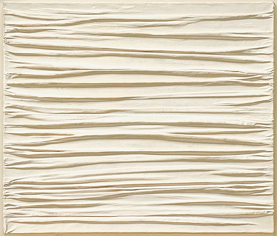
Following this poor misunderstanding of his first shows Klein began working exclusively in blue monochromes. He crafted his own hue of blue, International Klein Blue (IKB), a color he considered had a quality close to pure space and he associated it with immaterial values beyond what can be seen or touched. Klein's next exhibition, Epoca Blu, consisted of 11 identical blue monochromes painted with IKB-- effectively making his color an artwork, rather than just a component of it. The exhibition was a critical and commercial success and soon began touring. It's Parisian showing was advertised by postcards painted and sealed with IKB and the opening was marked by the release of 1001 blue balloons. Fellow artist Piero Manzoni's  work was deeply affected by Epoca Blu, to which his Achrome series (right) was a direct response to. Although Manzoni's Achromes were influenced by other artists as well as Klein, it could be argued that Klein inadvertently started and thus should be credited with the creation of Manzoni's career; making any and all of Manzoni's commercial success a work of art that Klein could sign off as his own work. Neither artist was new to the concept; Manzoli would sign 'living sculptures' and once claimed the world as his work, and as aforementioned Klein signed the sky. The two artists died a year apart and both of their deaths were signed by French artist Ben Vautier as his work.

Sources:
http://www.newyorker.com/arts/critics/artworld/2010/06/28/100628craw_artworld_schjeldahl
http://www.tate.org.uk/art/artworks/klein-ikb-79-t01513/text-summary
http://en.wikipedia.org/wiki/Yves_Klein
http://en.wikipedia.org/wiki/Piero_Manzoni


John Storrs and his Forms in Space

Forms in Space No. 1
John Storrs was one of America's foremost modernist sculptors. Born the son of an 'architect turned real estate developer' in 1885 , by 1911 Storrs was studying sculpture in Paris under Auguste Rodin. Throughout his career Storrs gradually moved from representational sculpture and wood engravings to the machine-like sculptures for which he is best known. Storrs developed a unique approach to sculpture that acknowledged historical influences ranging from Native American ceramics to ancient Egyptian and Greek stone carving. In the 1920's, Storrs combined these along with influences from avant-garde artwork in Europe, skyscraper architecture in America and stylization elements of Art-Deco to create sleek tower-like forms derived from his imagination. Storrs shirked marble, an academic medium that was chained to a classical style, in favor of working in materials more associated with industry rather than fine art. In his towers, Storrs sought "an expression of today" equivalent to "that strength and will to power, that poise and simplicity" that he perceived in modern construction. These sculptures experiment with the relationship between volume and space, the balance of vertical and horizontal masses, and the play of light on polished surfaces. Though often minimalist in visual statement, these towers evoke a strong sense of scale and strength, suggesting grand civic designs or public artwork rather than just sculpture on pedestals. There is a elegance of line in many of Storrs' works that suggests a nod to the work of Frank Lloyd Wright, of whom Storrs was an avid admirer. In each of his sculptures there is also a noted verticality that could point to the writings of Freud.

Sources:
http://www.berkshirefinearts.com/06-21-2010_john-storrs-machine-age-modernist.htm
http://www.nytimes.com/2011/04/15/arts/design/john-storrs-machine-age-modernist-at-the-grey-art-gallery-review.html?_r=0
http://johnstorrs.org/biographical-information.html
http://www.metmuseum.org/toah/works-of-art/67.238

Soft Construction with Boiled Beans (Premonition of Civil War)


"..a vast human body breaking out into monstrous excrescences of arms and legs tearing at one another in a delirium of auto strangulation"
                                                -Salvador Dali

Soft Construction with Boiled Beans (Premonition of Civil War) is a painting by the late Spanish surrealist Salvador Dali. The painting encompasses themes of eating, love, and war and the interrelation between the three. It was originally painted to represent the horrors of the Spanish Civil War, although it was painted six months prior. Dali claimed to have known the war was  going to occur to add to the "seemingly prophetic power of his unconscious mind," however an unstable climate of social and political unrest had existed in the country for years and it is likely that he may have changed the title after the outbreak of war to improve his prophetic image. The painting's hero is a gruesome humanoid monster seemingly tearing itself in two, it's face twisted in a grimace of both triumph and torture: a portrait of Spain through Dali's eyes. "A representation of the physical and emotional self-conflict in which Spain was both the victim and the aggressor" (John B. Ravenal) Dali used his signature "paranoiac-critical method" in this painting by contorting the massive limbs of the monster into an outline of the map of Spain. The smooth lines in the figure and the limp phallic form draped over the truncated hip give the figure a seemingly soft form giving it an almost natural, realistic feel, albeit no such creature exists in nature. Among the monstrous figure Dali has placed many other symbolic items. For instance, the painting has a numerous amount of boiled beans strewn about it's composition; Dali has been quoted saying that "one could not imagine swallowing all that unconscious meat without the presence of some mealy and melancholy vegetable."  For the background, Dali has painted a technicolor sky and parched landscape of his hometown Catalonia in a traditional fashion, creating contrast to the idea of revolution. There is also a small man looking down on the hand in the left corner of the painting, said to be a portrait of Sigmund Freud, whose work inspired Dali to embrace his nightmarish visions.

For more of Dali's work visit Espace Dali and Museum-Gallery Xpo: Salvador Dalí, Marquis de Púbol.

Sources:
http://www.philamuseum.org/collections/permanent/51315.html
http://www.philamuseum.org/micro_sites/exhibitions/dali/downloads/edu/imagePacket.pdf
http://en.wikipedia.org/wiki/Soft_Construction_with_Boiled_Beans_(Premonition_of_Civil_War)
http://theneedlessnessofwar.blogspot.com/2011/05/soft-construction-with-boiled-beans_12.html

Mobiles & Stabiles

Alexander Calder was an American sculptor that  developed an innovative method of bending, twisting and sculpting wire to create three-dimensional "drawings in space", much like David Smith. Calder was strongly influenced by the work of Piet Mondrian and is said to have stated, "I would like to make Mondrians that move," upon seeing Mondrian's works. It was after this encounter that Calder's works shifted from naturalistic representation into abstract composition. The very essence of Calder's work can be summed up as a dialogue between movement and immobility; he explored these two separate realities in his mobiles and stabiles, respectively. Calder's mobile's, a word coined by Marcel Duchamp, were kinetic sculptures designed using an ingenious system of weights and counterbalances, that moved freely when suspended, powered only by slight air currents. Calder regarding the creation of his mobiles in the later years of his career:

"I used to begin with fairly complete drawings, but now I start by cutting out a lot of shapes....Some I keep because they're pleasing or dynamic... Then I arrange them on a table, and arrange them, with wires between the pieces... Finally I cut calculating for balance this time... I begin at the small ends, then balance in progression until I think I've found the point of support. This is crucial, as there is only one such point and it must be right if the object is to hang or pivot freely. The size and angle of the shapes and how to use them is a matter of taste and what you have in mind.
To most people who look at a mobile, it's no more than a series of flat objects that move. To a few, though, it may be poetry."
 Conversely, his stabiles were stationary metallic sculptures. In the later years of his career Calder devoted himself to creating outdoor monumental sculptures, mostly stabiles designed for specific locations, that continue to grace public plazas in cities worldwide. Throughout his lifetime Calder not only revolutionized the art of sculpture by making movement one of it's main components, but he also created innovative works by exploring the aesthetic possibilities of nontraditional materials. Calder's mobiles and stabiles alike challenged the prevailing notion of sculpture as a collection of masses and volumes by proposing a new definition based on open space and transparency -- a major contribution to the development of abstract art. Both types of sculpture, although firmly rooted in the ground, give off a feeling of lightness due to their predominantly rhythmic lines and the beautiful finesse of their angular outlines.

Sources:

http://en.wikipedia.org/wiki/Alexander_Calder
http://www.nga.gov/exhibitions/calder/realsp/roomenter-foyer.htm
http://www.musee-lam.fr/gb/archives/355
http://artsy.net/artist/alexander-calder


Friday, April 5, 2013

Hudson River Landscape

“Is Hudson River Landscape the Hudson River, or is it the travel, the vision; or does it matter? The sculpture exists on its own, it is an entity… I want you to travel, by perception, the path I traveled in creating it.”
-David Smith

David Smith was an American abstract expressionist sculptor and painter best known for his large steel, abstract sculptures; he was also the first to work with welded medal. Originally trained as a draftsman and painter, Smith's works during the 1960's blurred the distinction between painting and sculpture and were often described as "drawings in space." These works, such as Hudson River Landscape, make use of delicate tracery as opposed to solid form, with a two dimensional appearance that contradicts the traditional idea of sculpture in the round. Deemed by many as the most important American sculptor of his generation, Smith synthesized influences from Cubism, Surrealism and Constructivism into highly personal art in a distinctively American style . He brought qualities of industrial manufacturing into the language of art and proved to be a decisive influence on later movements such as Minimalism. Hudson River Landscape was inspired by a 220 mile train ride from New York City to his home in Bolton Landing. The rust colored steel floats through space creating somewhat half-recognizable forms: railroad tracks, rounded clouds -- as if it were composed of multiple glimpses through a train compartment window. Although it may seem like a simple absracted landscape, it is revealed in his notebooks that Smith meant Hudson River Landscape to be much more:

"this sculpture will not be the mystical abode
of power of wealth of religion
Its existence will be its statement
It will not be a scorned ornament on a money changer’s temple
Or a house of fear
It will not be a tower of elevators and plumbing with every
Room rented, deductions, taxes, allowing for depreciation 
amortization yielding a percentage in dividends"
It is evident that Smith intended the sculpture to be a vision of a world free of capitalism and class society. Read more of Smith's notebook writings here.

Sources:
http://www.haberarts.com/dsmith.htm
http://www.theartstory.org/artist-smith-david.htm
http://www.aworldtowin.net/reviews/DavidSmith.html

Wednesday, April 3, 2013

Lucian Freud

Portrait of John Minton by Lucian Freud
‘I paint people [...] not because of what they are like, not exactly in spite of what they are like, but how they happen to be’
 -Lucian Freud

Lucian Freud was a German born, British painter known for his thickly impastoed portraits and figure paintings. He was also the grandson of Sigmund Freud. His works are noted for their psychological penetration, probably due to his grandfather's influence, and for their often discomforting examination of the relationship between the artist and model. To model for Freud meant to spend a great deal of time with the artist, especially in his later years: a nude completed in 2007 required sixteen months of work, during which the model had only four evenings off. It is this extensive time spent alone with the model that helps Freud's paintings stand out, allowing him to focus more on the character of the portrait than the drawing or paint handling. Many of his portraits bring out the models individuality. Art critic Martin Gayford noted in his book Man with a Blue Scarf: On Sitting for a Portrait with Lucian Freud, that the portrait Freud did of him seemed to "reveal secrets—ageing, ugliness, faults—that I imagine...I am hiding from the world..." Gayford also commented on Freud's sharp, penetrating and "omnivorous" gaze. Freud often painted people in his life; friends, family, lovers and fellow painters alike. "The subject matter is autobiographical" Freud said, "it's all to do with hope and memory and sensuality and involvement, really."  Freud's painting of fellow painter John Minton is notable for the 'psychological penetration' present in Freud's works and really  illustrates the connection he had with those who modeled for him. The face radiates regret and the eyes seem deeply unhappy. Minton committed suicide five years after the completion of the portrait; a real testament to Freud's ability to capture the true character and emotions of his models.

Sources:
http://www.tate.org.uk/whats-on/tate-britain/exhibition/lucian-freud/room-guide/lucian-freud-room-1
http://en.wikipedia.org/wiki/Lucian_Freud
http://www.telegraph.co.uk/culture/art/art-news/8655781/My-130-hours-sitting-for-Lucian-Freud.html


Monday, March 25, 2013

Jean (Hans) Arp

Human Concretion (1935)
Jean (Hans) Arp was a French sculptor, painter, printmaker and poet of German birth. He was a pioneer of abstract art and one of the founders of Dada in Zurich, as well as participating in Expressionism, Surrealism and Constructivism alike. In the 1930's Arp began experimenting with sculpture by creating figurative torsos with wood and plaster. Next, Arp began on a series of smooth biomorphic forms called Human Concretions. Each concretion shared common themes of growth, metamorphosis and crystallization as opposed to specific themes drawn from nature. Human Concretion (1935) shares the bulbous character and curved and coiled shape of many of the other concretions, giving off a sort of spontaneous energy as if it had just sprouted into being. It's form is reminiscent of the human female with its sensual, rounded contours. Despite their solid, almost earthy appearance, each of Arp's concretions seems virtually weightless, as if it were just floating in space. Arp preferred his sculptures to not be mounted on a base so that they could 'simply take their place in nature.' Many of them were conceived without a predetermined orientation and were often positioned in any and every direction. Critics deemed these concretions abstract art, a title Arp staunchly opposed. He often corrected critics saying that his works were "Concrete Art" because they occupied space, and that art was a natural generation of form. The term "concrete art" was coined by Theo van Doesburg in his Manifesto of Concrete Art (1930). Both Doesburg and Arp claimed that their aim was to not reproduce but to simply produce more directly. Arp once stated:
"Art is a fruit that grows in a man, like a fruit on a plant, or a child in its mother's womb"
In his concretions, Arp aimed to incorporate physical essence, with one part equated to the whole, concentrating form so as to increase the sculptures domination of space and its impact on the spectator.
A dominant personality within abstract art, Dada and Surrealism -- as well as prefiguring junk art and the Fluxus movement, Arp's reliefs and sculptures have had a decisive influence over the sculpture of this century.

To see one of his Human Concretions on display click here.

Sources:
http://allanmccollum.net/amcimages/arp.html
http://www.cavetocanvas.com/post/17563616992/jean-arp-human-concretion-1935-from-the
http://www.moma.org/collection/browse_results.php?criteria=O%3AAD%3AE%3A11&page_number=1&template_id=6&sort_order=1&displayall=1#skipToContent

Sunday, March 17, 2013

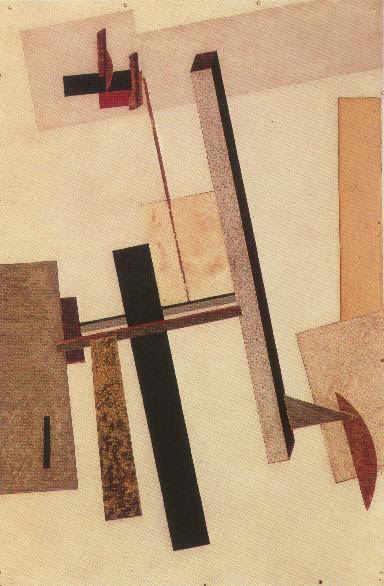
PROUN


Proun 2 (Construction)
In the climate of utopian expectation immediately following the Russian Revolution, artist El Lissitzky began working on a series of artworks that he entitled Proun -- a series he later described as "the station where one changes from painting to architecture." Lissitzky was committed to the notion that society could be liberated through abstract art. In his Proun series he explored the visual language of suprematism with spatial elements, utilizing shifting axes and multiple perspectives -- in a way creating his own version of the movement. Lissitzky, passionate about architecture and other 3D concepts, attempted to move suprematism away from it's strictly flat, 2D forms and shapes. His Proun series lasted for over half a decade and spanned from traditional, straight-forward paintings and lithographs into fully three dimensional installation works. Lissitzky's Prouns laid the framework for his later architectonic ideas and experiments in exhibition design. The exact meaning of "Proun" was never fully revealed, with some suggesting that it is a contraction of proekt unovisa (designed by UNOVIS) or proekt utverzhdenya novogo (Design for the confirmation of the new). Lissitzky had this to say:
 "…I cannot define absolutely what a ‘Proun’ is, for this work is not yet finished [...]  My aim—and this is not only my aim, this is the meaning of the new art— is not to represent, but to form something independent of any conditioning factor. To this thing I give the independent name Proun. When its life is fulfilled and it lies down gently in the grave of the history of art, only then will this idea be defined."
 Through his Prouns, LIssitzky developed utopian models for a new and better world. This approach, in which the artist creates art with socially defined purpose, could aptly be summarized with his edict "das zielbewußte Schaffen" or "task oriented creation."

For more listen to: Stop 412 El Lissitzky - Proun 2 (Construction)

Sources:
http://www.mcgill.ca/files/architecture/ACSA-Session7.pdf
http://en.wikipedia.org/wiki/El_Lissitzky
http://www.philamuseum.org/collections/permanent/53939.html


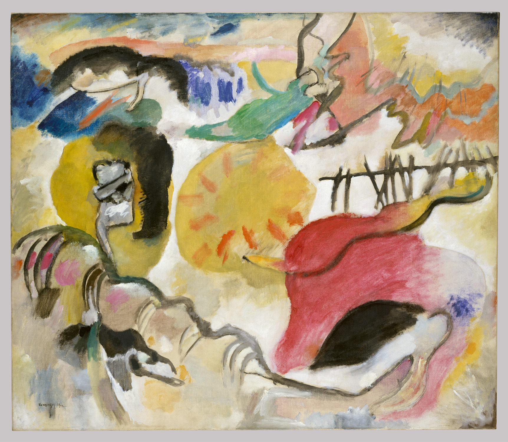
The Garden of Love

Improvisation no. 27 (The Garden of Love)
In 1911 Wassily Kandinsky co-founded a loose association of artists, Der Blaue Reiter (The Blue Rider), to promote a new more spiritual and emotional approach to art as opposed to the materialist approach that was popular at the time. The following year, when he painted The Garden of Love, Kandinsky also published his famous book Concerning the Spiritual in Art. In it he spoke of his beliefs in primacy of the inner, spiritual world and his unique take on color theory (due to his synesthesia). Kandinsky sought to express spiritual truths through his art; working in the abstract, he believed that by dematerializing the appearance of his subject, without completely removing visual reference to it, he could reveal the true essence of the subject. The visual reference that he drives at in The Garden of Love is most likely that of the biblical story of the Garden of Eden and Paradise -- Old and New testament themes were recurring in Kandinsky's works. The composition consists of a large yellow sun that is seemingly pulsating rays of red, but that is the only recognizable feature of the painting. Kandinsky also suggests three abstracted embracing pairs of figures as well as several animal shapes. He suggests these images rather than clearly depicting them because he believed that the idea of The Garden of Love could be expressed without explicit representation of the physical world. Kandinsky's ultimate goal was for his art to be able to communicate on its own terms, independent of naturalistic signs. He used lines and color as the foundations of this visual “language” that he likened to that of music, which expressed pure emotion free of representation. Kandinsky often used musical terminology to describe his work, and in the subtitle of this painting, the word improvisation suggests "a largely unconscious, spontaneous expression of inner character, the nonmaterial nature."

Sources:
http://www.metmuseum.org/toah/works-of-art/49.70.1
http://www.learner.org/courses/globalart/work/231/index.html