Friday, March 8, 2013

Carcass of Beef

Carcass of Beef - Chaim Soutine
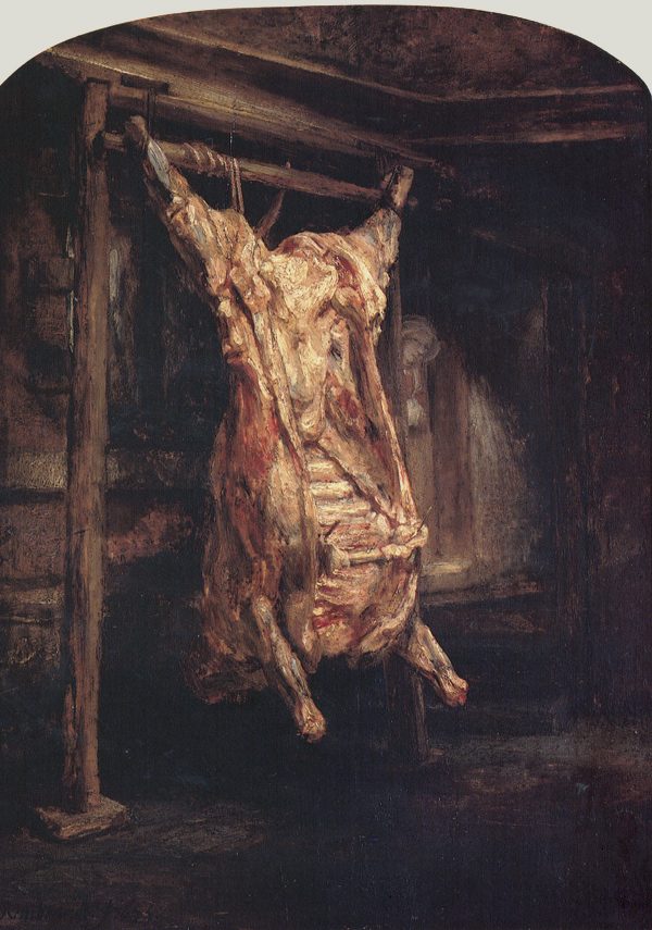
Chaim Soutine's Carcass of Beef was influenced and somewhat inspired by Rembrandt's Slaughtered Ox, which is shown below. Rembrandt's painting has been associated with the crucifixion of Christ in the way that the legs of the ox resemble Christ's arms on the cross. Though, Soutine's version of this painting looks less like the story that Rembrandt's painting has been linked to. 
To make this painting, Soutine took a decaying carcass from a butcher in his town, drug it to his apartment where it sat while he painted it. His neighbors didn't like the smell after a few hours or days of sitting in the apartment building and they asked him to remove it from his room. 
Carcass of Beef was also mentioned in the movie Mona Lisa Smile as a class of art history students are asked if it is any good. 

There is a poem written about Soutine's painting, which is also entitled "Carcass of Beef".
This poem is by Rick Mullin and it describes the painting of the Carcass of Beef by Cahim Soutine. 
 They’d broken through the old brick wall in Castaing’s 
carriage house, a renovation under way.
Soutine took full advantage of this, casting


chickens in full plumage pendent, gray
and gold and green against a jagged frame
of darkness, squawking in the ecstasy


of death. Talons, beaks and wattles flamed
and sputtered in a nightmare space of murder
on his canvas. A still life series ran to game, 


the hare against the green slats of a shutter,
the turkey on a cloth with golden apples.
Soutine conveyed their extremis in color.


Not satisfied, he bartered with his hapless
dealer to procure a side of beef 
when he returned to Paris. Butchers grappled


with a battered carcass up the stairs, a brief
comedic interlude at the apartment
he’d been renting. To the hired men’s relief


it made it through the door. The painter sent
for Paulette once the butcher’s boy had hung
the cage of ribs. His motif was the Rembrandt


at the Louvre, that bleeding carcass strung
upon the rack across a room ... the girl
appearing at the door. But Chaim would come


a little closer to his model. And he’d hurl
himself at more extensive spans of canvas.
Paulette arrived to find him in a world


of meat, his palette fat with gristle and his
model dripping on the floor. She placed
a pan to catch the blood. “But Chaim, can this


thing hang here overnight?” Paulette could taste
the painting as the smell of colors mixed 
with beef. Apparently the painter faced


another sleepless night. His helper fixed
herself a bed this time, but had to wake
each hour to baste the hulk. “Paulette, the trick’s


to keep it bleeding,” Chaim commanded. “Make
it wet.” She wet it. And when the morning sun
came shining through the window, you’d mistake


the carcass for a red CĂ©ret, a run-
ning track of bones beneath a sagging skein.
By noon, the horrid greenback flies had come


and Soutine had another canvas pinned
and propped against an oil-splattered table.
He mixed a pile of cobalt and alizarin,


a blackout violet at the center of a scumbled
wheel of colors bleeding into gray.
His oil palimpsest began to bubble


in the heat as Soutine layered splay
on splay of tortured meat between
the scratchwork ribs to end the second day. 


And sunrise found him scraping back the green
he’d laid in semidarkness. Hours passed.
The colors changed. The carcass wore a sheen


of viscous rot, its rind a venous blast
of atrophy. It cracked in hieroglyphs
of morbid skin. The painter, slouching, cast


his shadow on the sagging monolith. 
By 12 o’clock, the neighbors were amassing 
in the hall. No one ever bothered with 


Soutine from day to day, but he was asking
for it this time. The building smelled like rotting flesh.
The landlord pounded on the door. “You bastard!”


“Go away!” “Enough, Soutine. Unless
you haul that garbage from the building
I will have you hauled away.” This fresh 


affront made Chaim throw down the brush. “You’re killing
me! I told you fifty times—I paint!
This is my studio.” The landlord was unwilling


to put up with it, and a complaint 
was filed. The gendarmes were the next to knock.
“Soutine, you have to let them in.” This faint,


exhausted plea from Paulette hit him like a rock.
He stopped his painting, calmly turned around,
unlocked the door, and opened it. The shock


was registered succinctly when the gendarme found
the carcass hanging in a buzz of flies.
“Explain, monsieur.” The captain looked around


as Soutine plied him with apologies
and Paulette fumbled with the swatting broom.
He saw the three completed pictures. “These


are marvelous,” he mumbled, and the room
depressurized. The sympathetic officer 
allowed the tired painter to assume


the mantle of an artist in the aperture 
of his protected space. No law applied.
“I agree you should continue here, monsieur,


but how securely have you got this tied?”
He checked the knots and nodded in approval.
“Are you familiar with formaldehyde?”


He suggested opening a window. The removal
of the body was postponed until the weekend,
giving Soutine three more days. In all


that time, Paulette would later swear, her friend 
remained awake and working. They hardly spoke.
Soutine, his shoulders hunched, would lean against


a chair and load a brush and lunge. He broke
a dozen brushes in a day. Three times
he tried to eat—but eating made him choke.


Paulette would pull the bowl away. “Oh, Chaim,
you need to stop.” “I’ll finish when
it falls apart.” It fell. And from the slime


his hanging carcass series rose to 10,
each painting fully spread with crucified
and falling cattle, seething gristle end-


to-end. On Saturday, the thing would slide
across the floor and down the stairs and out,
a golem slab extinguished in a tide


of passion, fallen in a savage bout
of extra rounds. Soutine himself collapsed.
Zborowski paid to sanitize the rout


and crossed the landlord’s palm. Paulette, perhaps
intuiting an impact on the painter’s
ulcer, diagnosed exhaustion as a relapse—


she’d seen him through the throes of stomach pain.
Her premonition, her experience,
and her devotion would serve him well again.


Thursday, March 7, 2013

Carcass of Beef by Chaim Soutine

       Artists paint a lot of different things: landscapes, scenes of everyday life, people, models, bowls of fruit, scenes from scripture and mythology, and so on. So when Chaim Soutine decided to paint a carcass of beef in his own studio, I was quick to take an interest in it.
       Soutine was Jewish by religion. He grew up in a ghetto where there was little food, so that unfortunate circumstance likely influenced his decision to paint a portrait of the carcass to the point that it was rotten by the time he was done.

Carcass of Beef in the... flesh. 1925, oil on canvas.
        As the title of the work suggests, it features a carcass of beef that Soutine had obtained through unspecified means. The carcass hung in his studio the entire time he was painting it, and it was rotted thoroughly by the time it the work was completed. The stench was so profound even as Soutine painted it, his neighboring tenants in the apartment notified the authorities of the carcass's presence. So what was the reason behind Soutine's apparent madness? As it turns out, the "carcass of beef" idea had been done by another artist: Rembrandt van Rijn, who is still considered one of the artistic greats of the 17th century. Apparently, Soutine's plan was to emulate Rembrandt's style.


Carcass of Beef by Rembrandt van Rijn. 1675, oil on canvas.


       Soutine was part of a group of artists known as "The Damned." These artists were living manifestations of the stereotypical starving artist: living in poverty and a perpetual state of malnourishment, and with a career consisting of just enough sales to get by. Fortunately for Soutine, Dr. Alvert Barnes, a collector of art, bought enough of Soutine's works in 1923 for Soutine to be free of financial difficulty for the remainder of his life.
       Unfortunately for Soutine, the Nazis eventually occupied France during World War II in 1940. Since he was a known and registered Jew, Soutine had no choice but to flee for his life. His plan was to escape France, but a stomach ulcer necessitated his return to Paris to seek treatment. The ulcer ultimately took his life after a failed treatment. Soutine's Jewish upbringing and life of poverty was a major influence throughout his career.

       For a full biography on Soutine's life and a gallery of his works, visit

       http://www.abcgallery.com/S/soutine/soutinebio.html (Biography)
     
       http://www.abcgallery.com/S/soutine/soutine.html      (Gallery)


       For more information on events in France during World War II, visit

       http://www.eyewitnesstohistory.com/francedefeat.htm


Wednesday, March 6, 2013

Unique Forms of Continuity in Space

Unique Forms of Continuity in Space was the culmination of two years of drawing, painting and sculpting careful studies of human musculature by Umberto Boccioni. Boccioni was a principle figure in the Futurism movement who strove to depict a "synthetic continuity" of motion instead of an "analytical discontinuity" that he saw in artists like František Kupka and Marcel Duchamp.  In Unique Forms of Continuity in Space, Boccioni attempts to communicate speed and forceful dynamism through sculpture -- a prevalent theme in most of his work. In doing so he creates an aerodynamic, fluid "anonymous superhuman figure" that seems to be gliding through space, it's form rippling outward as if it were being molded by the wind it was passing through. Art historian Joshua C. Taylor comments:
"The figure in Unique Forms of Continuity in Space strides forth, a symbol of vitality and strength, yet its impetuous step rests lightly on the ground as if the opposing air gave the figure wings. It is muscular without muscles, and massive without weight. The rhythms of its forms triumph over the limitations of the human stride to suggest unending movement into infinite space"
Boccioni,  tremendously exhilarated by the speed and force of new, twentieth century machinery, was very headstrong that Futurism was what art should be. In 1912 he wrote Manifesto tecnico della scultura futurista (Technical Manifesto of Futurist Sculpture) . In it he bashed all other forms of sculpture worldwide:

"In all these manifestations of sculpture, from the most mechanical to those moved by innovating currents, there persists the same error: the artist copies live models and studies classical statues with the artless conviction that he can find a style corresponding to modern feeling, without giving up the traditional concept of sculptural form."
Despite his strong convictions to the contrary, even Boccioni's sculptures were reminiscent of classical works. In Unique forms of Continuity in Space there is an underlying resemblance to the Winged Victory of Samothrace; both demonstrating a sort of flowing movement. Through reshaping the figure and in the wake of the figure, respectively. The lack of arms in Unique Forms also pays tribute to Auguste Rodin's Walking Man

Sources:
http://www.nytimes.com/2004/02/13/arts/art-review-blurring-the-line-between-the-present-and-the-future.html?pagewanted=2&src=pm
http://www.metmuseum.org/toah/works-of-art/1990.38.3
http://www.moma.org/collection/object.php?object_id=81179


Metal Dance by Oskar Schlemmer (1926)


Metal dance as described from the posted video in the sources is: Metal dance describes the geometric transformation by means of reflection to symbolize the transient platter of spatial order.

(SOURCE 1 VIDEO) 0:00-0:42

Personally, it is to me like our artist has been inspired by cubism and the development of a peculiar geometrical picture style with focus on the human figure. Specifically in this example the metallic being technology subordinates the human. In the dance, the human figure becomes a phantom with the elements of metal around him/her.

(SOURCE 3 VIDEO)
Seen from our perspective, the left side depicts the wavy metal plate that constructs illusions of continuity, the right side is the “stairs-like” metal plate inferring to the rigidity of machines, the flat metal plate below our dancer is the heuristic of the reverse of light-from above, the cylinder formed metal structures behind the dancer is portraying routine as of the circular elongated form, and last is the round “gloves” if I may that influences the boldness.


It is not easy for me to understand the dance without contextualizing the dance with the time of Bauhaus, but then again; it takes me back to the fact that nearly everything out of Bauhaus is still not “old-fashioned” in any sense. The creations still have a reminiscence of modern art in any sense despite the fact that it is right around 90 years since its creation.

The lighting on the thin plates creates a visual for the reflections that with the dance makes everything become one single unit.
For more information, see the sources. Disappointingly, the video of the dances can not be openly be posted due to copyright concerns, so I strongly encourage you to click the links for better understanding. 

Sources:

Several Circles No. 323

Several Circles No. 323 by Wassily Kandinsky is reflective of his thoughts and preferences of geometric shapes, overlapping planes, and delineated shapes at this time. His art, like many of the other works of art produced at this time, during and after World War 1, were very much influenced and affected by the war and by what the people saw and underwent as means of fleeing from the war or enduring it because they didn't want to leave their homeland or they didn't have a way out of it. This painting reflects a similar scene as a painting we have studied before by Frantisek Kupka. 
Discs of Newton is a representation of the discs of light in Newton's perspective. They represent movement and the passage of time, the fourth dimension, and they were made to look as if they were rising off of the canvas toward the viewer. Like the painting Several Circles No. 323, this painting was had association with the unforeseen forces on the Earth, whether it be a Utopian way of art or life, or the discs of light that are invisible to the human eye.  
On White II, above, was another of Kandinsky's paintings around the same time as his Several Circles was painted. Comparing these two paintings, they look nothing alike and they certainly do not look like they were painted by the same artist. The fact that Kandinsky moved toward more geometric shapes brings about the question, why? Was he simply tired of his viewers who didn't have his same talent not understanding his paintings? Was there something different going on in his life at the different times of these two paintings? It could have been a number of these things, most of which have to do with the fact that he thought that if he used more practical shapes and didn't try to represent music in his art as much, people would understand it and appreciate it much more. So, his personal drive to help the viewers of his art understand it more fully drove him to change his personal painting style into what we see at the top of the page. But was this what truly made him happy and feel fulfilled as an artist? We may never know. 

The Open Window

The Open Window
Henry Mattise
Henry Mattise’s painting, The Open Window, brings out two different emotions in me when I look at it.  On the one hand,  the colors and softness of the flowers and ocean scene seem to be happy and relaxing. I feel like I’m being called out to experience the world beyond the window, and it’s a beautiful world.  On the other hand, the darkness around the upper windows and left wall along with the feeling of a small space as I  stand in the imaginary room looking out the window stirs up a feeling of being boxed in.  Of wanting to get out.  This seems appropriate considering that Mattise  painted this work during a time of change.  He was coming out of his “dark period” in 1905 when this was painted and had also been influenced by Paul Signet and his work with the pointillist technique.  Mattise loved color and was part of a group of artist that had begun challenging the traditional style of painting.  This change started with the Impressionists, continued with the Pointillists and now moved to Mattise and the Fauvisms.  These artists were part of movement that challenged the way people saw things and attempted to change the accepted ways of thinking that had remained for centuries.  This can also be seen in the Antarchist movement that artists such as Signet were involved in, to the hints of change in the social systems because of vast differences between the aristocrats and the paupers, and  in the break between France and the Catholic church in 1905 when they officially seaparated the two by law.  The early 1900s saw many changes but these were a few that may have influenced Mattise in his quest to push the envelope in his works.
Not only did the changing times and the changing work of artists such as Signet influence Mattise,  but the post-impressionists such as Cezanne and Van Gogh did as well.  His travels in the early 1900’s also affected his art and the use of color that he used.  A trip to the southern coast of France is the setting for this particular work and it resembles Signet’s work  The Port of Saint-Tropez.   When showing this work for the HVS I would suggest showing it with this piece as well as another piece by a contemporary such as Maurice de Vlaminck’s work The River Seine at Chatou because it seems to resemble this The Open Window in style and color. 

Tuesday, March 5, 2013

New York, Night Georgia O'Keefe

In the midst of a mechanical revolution, many artists took the side so to speak against the modernization of cities. As we saw in Chicago, architects and artists had to even de-modernize their works in order to be more appealing to the public, and feel less protruding.

On the other side of this, though exist the works of Georgia O’Keefe. O’Keefe’s works historically consisted of simple, true to their nature depictions. She came from the SouthWestern United States to live in New York City and up until then, had painted many scenes from nature, like flowers and the New Mexico desert. As an outsider, it would have been easy for O’Keefe to take a defensive view of what was being revolutionized in New York City. However, O’Keefe instead assumed a more stoic stance regarding the changing times in the modern city. To O’Keefe, the city was another part of human evolution and nature. So as a result in her work, she painted the city as just that. 


Although her depictions do not narrate a certain feeling for or against the city, as someone who has spent a large amount of time in New York, I appreciate the consideration that she does give to it. By doing so, we now have paintings from that era that are peaceful, while simultaneously strikingly beautiful and politically neutral.

Bauhaus (School of Building)

       The Bauhaus Building, based in Germany from 1919 to 1933, can be described as the model art academy. It dealt in all recognized forms of creative craft of its time, including, but not limited to design, textile, ceramics, painting; the list goes on and on. It is important to note that at this time, almost the entirety of Europe had been modernized, and Germany was no exception. According to Walter Gropius, a Modernist architect, increased emphasis was being placed on art as applied to design and construction, and no longer for mere portraiture. He mentioned that the Salons were still going on, but no longer held the same status that they did more than a hundred years ago. Alongside the Bauhaus Building's all-around approach to art, the design of the building itself is also important.
       For this post, I will focus on the architectural design of the building.

The Bauhaus Building from one angle.


The Bauhaus Building from another angle.
       The Bauhaus Building was part of the modernist movement in Germany, which can be summed up with five characteristics:

          1. Support elements (piloties) will elevate the mass off of the ground.
          2. No load-bearing walls. That is the job of the piloties.
          3. Free facade. There is no relation with the outside of the building and the inside of the building.
          4. Long horizontal sliding windows (curtain walls).
          5. Green roof. The turf that the building takes up will be "moved" to its roof.

       While the Bauhaus Building was shut down in 1933 with the takeover of the Nazi regime the five characteristics that it stood for can be applied to just about every modern building around us. I took pictures of various campus buildings to show the similarities between them and the Bauhaus Building. Buildings like Halbouty Geosciences, the Memorial Student Center, and the Evans Library Annex all share elements of modernism with their square shapes, dynamic interiors, skylights, spiral staircases, and large windows.
       After fleeing from Nazi Germany, Gropius ultimately settled in Boston, where he proceeded to teach at Harvard. In the United States, modernist architecture took root, setting the foundation for most modern cities.
     
       For a small excerpt from Gropius's Die neue Architektur und das Bauhaus: GrundzĂĽge und Entwicklung einer Konzeption, visit 

       http://modernistarchitecture.wordpress.com/2010/10/28/walter-gropius%E2%80%99-the-new-architecture-and-the-bauhaus-1925/

       For more information on modernist architecture in America, visit
 
       http://www.cmhpf.org/educationmodernism.htm

Olga Rozanova’s Untitled (Green Line)


While in Art School, I took a class on color theory. It undeniably changed my perspective on color and the spectrum of the world around us. I began to notice pigmentation and shadows and the brilliance of colors which I had never before noticed or considered. As a result, now I am constantly searching for pieces of art and installations which further entice my appreciation for color.

When we looked at Olga Rozanova’s Untitled (Green Line) I didn’t have much of an initial reaction except for noticing its minimalist tendencies. Even the name was as stark as possible. Upon further inspection, however, I realized that Rozanova was really conveying more about the color than anything else. By being minimalist and making the only thing to focus on in the painiting the green line, the viewer is forced to analyze and inspect, not the line which could be found anywhere, but the green. The color is put in a light and context among great masterys of art. In galleries and even now in our art history class years later, among many human made pieces of art, what stands out in Rozanova’s work is truly the color that she utilizes. Among pictures portraying heros and dictators the color green, the shade and the manifestation becomes as iconic as one of Picasso or Degas’ commercialized paintings.


At the time, Rozanova assumed the role of promoting her color. Now, we have an actual “authority” for that. Pantone, the makers of many art products and color samples has become almost a monopoly in the world of color. They even assert a “color of the year” every spring. This year, it happens to bear a striking similarity to that in “Untitled(Green Line)” It is interesting to look at how the viewing of color has changed over the years, from nature to paintings to commercialized companies becoming authorities. Of course these changes are not surprising due to the nature of our culture. The important part is that color is still represented, and I am happy to say I believe even if commercialized, it is.


Panton's Color of the Year Website

Monday, March 4, 2013

The Trench by Otto Dix (1923)

Modern warfare, or at least for its time…

This painting is full of features depicting the aftermath of World War I. The art after World War I was very much influenced with descriptive representations of the horror that happened in the trenches, and also the unfair treatment of returned war heroes.

It is rational with nature taken in account of the time were there was generally a deep mistrust of society; it created the expression of social resentment for the horror of war. The nature of the colors tells me that this artist is maybe trying to empower the political awareness among society, and projecting that the future is not all so bright.

This reality shows the ugly side without any sentimentality through a language of ideas that is expressed with very banal themes; something as explicit as dreams. In this painting, it is the reality of the situation that comes to expression more that the perspective of light, but essential contour, and precise and tense expressions plays an important artistic role.

The reason why I mention dreams in this context is because I am relating it to another very famous piece of art by Salvador Dali called “The Persistence of Memory” (1931). It is two different artists, genres, and times.  Essentially everything is different, but I draw a line between these two paintings in the setting, and most important the essence or first expression of destruction.


Sources:


3


Stag at Sharkey's

Stag at Sharkey's by George Bellows
When he first joined the art world, George Bellows was a follower of Robert Henri and The Eight ("apostles of ugliness") -- a group Bellows later joined. Henri and The Eight rejected French Impressionism and American painting that glorified the American West and instead sought realism in art, finding inspiration in their hometown, New York City. Henri's circle produced paintings that were dark, dirty, and reflective of life in a changing America. Bellows's Stag at Sharkey's embodies this gritty outlook of life and in doing so perfectly captures the violent, masculine nature of this era in New York's rich history. At the time of completion of this painting, 1909, boxing or prizefighting was illegal. Nevertheless many people came out to places like Sharkey's to see the spectacle and business was booming for underground boxing clubs. Bellow's captures the audience's violent expressions and sick pleasure in the fight but pictures the boxers themselves in an almost graceful light. Sister Wendy Beckett comments on this contrast between the fighters and audience and how Bellows saw them:
"Now, if you look at the kind of people who've come to watch, you can see that Bellows didn't respect them.... If Bellows felt an amazed disgust for the viewers, he didn't feel that for the boxers. He Admires them. "
Bellows also commented on his representation of the fighters in 1910, saying that
"I am not interested in the morality of prize fighting. But let me say that the atmosphere around the fighters is a lot more immoral than the fighters themselves"
The Belvedere Torso
Bellows's verbal critique of the atmosphere surrounding the fight suggests an artist is looking onto the drama of the fight just as all the other spectators are. In the act of painting Stag at Sharkey's, Bellows was thus actively engaging himself in the thrill of the fight as this artist.

 In his composition of the fighters, Bellows uses an extremely dramatic curve to stress the back of the fighter on the right. This curve is reminiscent of The Belvedere Torso, a Graeco-Roman marble sculpture. The fighter's face is shrouded giving him the anonymity of the sculpture. The two also seem to have equally as massive strength given their muscle definition. There is no doubt Bellows was referencing the torso, and yet, very unlike the sculpture, Bellows uses slashing brushstrokes to magnify the violence of boxing and exaggerate this muscular, primal performance.

For more on Stag at Sharkey's and it's themes of "boxing, violence, and male identity" read Robert Haywood's piece from the Chicago Journal (1988): http://matrix.msu.edu/hst/hst324/media/bellows.pdf
and view A Stag at Sharkey's George Bellows.


Sources:
http://www.metmuseum.org/exhibitions/listings/2012/bellows
http://www.pbs.org/wgbh/sisterwendy/works/sta.html

Dove/ O'Keeffe

Fog Horns (1929) by Arthur Dove

"I would like to make something that is real in itself that does not remind anyone of any other things, and that does not have to be explained like the letter A, for instance." 
- Arthur Dove

Arthur Dove believed that color and form were instruments with which to express the essence beneath the physical exterior of things. He often painted amorphous 
shapes typically in muted colors -- beautifully demonstrated by Foghorns. In this painting, Dove transforms the blare of foghorns into an abstraction that is immediately recognizable, on some subconscious, intuitive level through the simple use of size-graduated shapes and gradations of hue: a feat not easily attained, and yet it seems so simple upon viewing. Instead of immediately demanding the attention of the viewer, the power of Dove’s work is cumulative and slow-moving. His paintings seem very simplistic and are not exceedingly dramatic or instantly attention grabbing. Dove paints in an introspective abstraction style that viewers can only truly appreciate after spending some time meditating on his works.

Music Pink & Blue by Georgia O'Keeffe
Dove has influenced many great artists since his passing. He has been credited with exercising an indirect influence on the first generation of Abstract Expressionists, such as Jackson Pollock and Mark Rothko, who both place similar emphasis on the artist's subjective experience. The artist whom Dove had the greatest influence over, however, was Georgie O'Keeffe. After seeing Dove's pastels at the Forum Exhibition of Modern American Painters in New York in 1916, O'Keeffe began to explore color and abstraction in a series of drawings and watercolors. Renowned photographer Alfred Stieglitz, friend of both Dove and O'Keeffe, displayed several of them at his noted gallery at 291 Fifth Avenue in New York --where Dove had his first solo show -- in 1916 and 1917. Dove admired the works O'Keeffe showed at 291, and the two artists finally met in 1918. O'Keeffe seriously considered giving up painting entirely early on in her career. Although she was an award winning art student, she wasn't particularly interested in painting those subjects for which she was lauded. Seeing Dove's work helped O'Keeffe to find her own visual voice. When she was in her 70s, O'Keeffe recalled that,
“It was Arthur Dove who affected my start, who helped me to find something of my own.”
For more about Dove and O'Keeffe's influences on each other go to: Dove/O'Keeffe: Circles of Influence and listen to the audio tour of the exhibition. 

Stanton MacDonald Wright: Synchronomy in Orange

Stanton MacDonald Wright was an American born artist who is mostly known for his contribution in co-founding the early abstract synchronism  movement. Synchronims is a color based form of painting that blends ideas similar to Kandinsky painting through music, along with cubism's and futerism's focus on movement and technology. For instance, Mac Donald Wrights painting Yellow-Orange uses geometric forms to produce the perspective of an aerial view of rooftops, as seen from an airplane. When looking carefully, we can see the engine and propeller of an airplane as it moves through clouds in the sky. Indeed, MacDonald wright uses a variety of color and musical influence as a form of expression.

Aeroplane Synchromy in Yellow-Orange


Sources:
http://en.wikipedia.org/wiki/Stanton_Macdonald-Wright
http://www.metmuseum.org/Collections/search-the-collections/210008722

Georgia O' Keeffe: Music- Pink and Blue

Georgia O' Keeffe is best known for her contribution to the American Abstraction movement and her focus on bio-morphic abstraction, in particular. Most of her paintings are focused on close ups of flowers, however she also experimented with painting urban settings such as buildings as well as animal bones. Although critiques tried to associate O' Keeffe's work with sexual ideas, that was not her intention. For instance, O' Keeffe's painting Music Pink and Blue may have been misinterpreted as female sex organs to a student of Freudian philosophy, however the painting is actually intended to illustrates her ability to use precision in order to portray sound. In the painting Music Pink and Blue, paint layers on itself and reminds me of water, creating a feeling of calm. 


Sources:
http://en.wikipedia.org/wiki/Georgia_O'Keeffe
http://smarthistory.khanacademy.org/okeeffes-the-lawrence-tree.html
http://www.metmuseum.org/toah/hd/geok/hd_geok.htm

The Skat Players

The Skat Players by Otto Dix, like may other works of art we have talked about, shows the extreme losses that men who served in the military faced at this time. In the service they lost legs, arms, ears, as we can see in this particular painting, and others lost more limbs and other things. To me, this painting shows the horrible things that war can bring. It shows that the few fight for the safety and peace of the many. Men like this gave their lives for the safety of the people in Germany.
 
Cezanne, an artist we have formerly talked about, also painted men playing cards at a table, but it was many many years before Dix painted his war-torn version of the same kind of scene. In Cezanne's painting, the men do not look like they have been to war, they don't seem to be missing any limbs, and this painting is an altogether much less depressing painting than Dix's. Thought, Dix was just painting what was really going on at that time with all of the veterans of the war coming home and going through life with all that the war had not taken from them and making the best of it.
 

Erich Heckel painted this picture around 1912 where we can see a scene similar to that of The Card Players and The Skat Players. In this painting, we can see the picture hanging in the background that looks like a person that has been starved or tortured, which is Christ. We can see the face of suffering of the man to the left and what looks like a menacing grin on the face of the man on the right of the painting. These men, like those of The Card Players, and in contrast to the men in The Skat Players, don't look like they have seen or been to war. They too are not missing limbs or ears and don't look to have any distorted parts of their bodies. Though, the scene is much like that of The Skat Players, the players in this scene have not been through the tough times and the hard times that war brought to the men of the firs painting above.